xHTML / CSS:如何使内部div得到100%宽度减去另一个div宽度
我有两个嵌套的div内外,其中有宽度:100%。 两个嵌套div应该在一行,首先应该从它的内容得到它的大小:
<div id="#outer" style="width:100%; border:1px"> <div id="#inner1" style="border:1px; display:inline"> inner div 1. Some text... </div> <div id="#inner2" style="width:100%????; border:1px; display:inline"> inner div 2... </div> </div> 问题是如果#inner2 div的宽度没有被指定,并且取决于它在里面是什么,如何让#inner2 div获得水平空间的其余部分?
PS在我的情况下,所有样式都在不同的类中,为了简化起见,我把CSS放在样式属性中。
我想要结果在IE7 +和FF 3.6中工作
在我看来更多的细节看起来像这样:
<style type="text/css"> .captionText { float:left; } .captionLine { height: 1px; background-color:black; margin: 0px; margin-left: 5px; margin-top: 5px; border: 0px; padding: 0px; padding-top: 1px; } </style> <table style="width:300px;"> <caption width="100%"> <div class="captionText">Some text</div> <div class="captionLine"> </div> </caption> <tr> <td>something</td> </tr> </table>
这是我想要的形象: 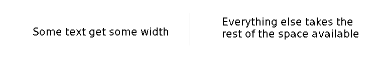
神秘的overflow: hidden; 在这里是你的朋友。 它阻止浮动附近的元素延伸到浮动后面 – 我认为这是您要寻找的布局。
这里有一些稍微编辑的HTML:我不认为你可以在你的id有#字符:
<div id="outer"> <div id="inner1"> inner div 1. Some text... </div> <div id="inner2"> inner div 2... </div> </div>
这里是CSS来实现你想要的布局。
(我为IE 6添加了附加的HTML 条件注释的 CSS,我只是注意到你实际上并不需要它在IE 6中工作,但是如果你喜欢IE 6的用户,
<style type="text/css"> #outer { overflow: hidden;/* Makes #outer contain its floated children */ width: 100%; /* Colours and borders for illustration purposes */ border: solid 3px #666; background: #ddd; } #inner1 { float: left;/* Make this div as wide as its contents */ /* Colours and borders for illustration purposes */ border: solid 3px #c00; background: #fdd; } #inner2 { overflow: hidden;/* Make this div take up the rest of the horizontal space, and no more */ /* Colours and borders for illustration purposes */ border: solid 3px #00c; background: #ddf; } </style> <!--[if lte IE 6]> <style type="text/css"> #inner2 { zoom: 1;/* Make this div take up the rest of the horizontal space, and no more, in IE 6 */ } #inner1 { margin-right: -3px;/* Fix the 3-pixel gap that the previous rule introduces. (Shit like this is why web developers hate IE 6.) */ } </style> <![endif]-->
testing并在IE 6,7和8中工作; Firefox 3.5; 和Chrome 4。
如果你正在读这个,你可以使用calc ,所以要感激。
HTML
<div class="universe"> <div class="somewidth"> </div> <div class="everythingelse"> </div> </div>
CSS
.universe { width: 100%; height: 100%; } .somewidth { width: 200px; height: 100%; } .everythingelse { width: 800px; /* fallback for emergencies */ width: calc(100% - 200px); width: -moz-calc(100% - 200px); width: -webkit-calc(100% - 200px); height: 100%; }
请参阅JSFiddle上的工作示例 。
您需要将inner1 div浮动到左侧,如下所示:
<div id="#outer" ....> <div id='#inner1" style="float:left; border: 1px solid #000;"> blabla </div> <div id="#inner2" style="... DON'T USE WIDTH AND DISPLAY HERE! ..."> gnihihi </div> </div>
这应该做的伎俩。 一探究竟! 再见
你不需要使用div来嵌套元素,只需要像这样使用SPAN
<div> <span style="display:inline-block;width: auto;border: solid 1px black;"> hey you </span> <span style="display:inline-block;marging: 0px 2px;border: solid 1px black;"> always use proper tools. </span> </div>
扩展@Nasser Hajloo的答案,这对我(甚至在IE6)
<div style="width: 400px; border: solid 1px red;"> <span style="float:left;width: auto;border: solid 1px black;"> hey you </span> <div style="display:inline-block;margin: 0px 2px;border: solid 1px black;">always use proper tools.</div> </div>
尝试使用小于400px的主div来查看它是如何调整的。 (它也适用于div而不是跨度 – 关键是在第一个div / span中的宽度:auto 。)
试试这个:在inner1里面嵌套inner1 ,然后从inner1里面移除display:inline ,像这样:
<div id="#outer" style="width:100%; border:1px solid red"> <div id="#inner2" style="width:100%; border:1px solid black;"> <div id="#inner1" style="border:1px solid blue; display:inline"> inner div 1. Some text... </div> inner div 2... </div> </div>
你可以看到它在这里工作: http : //jsbin.com/adiwi
从你的代码,它看起来像你试图得到一个水平线来填补你的div中的空白空间。 如果我是正确的,你想用标记创build一个视觉效果。 如我错了请纠正我。
(很高兴看到你想要的图像)
例:
Title --------------------------- or Title: Caption ------------------
这不是最好的做法。 你应该尝试用CSS来获得这个效果。
尝试使您的代码更加语义优先:
<div id="#outer" style="width:100%; border:1px"> <h3 style="border:1px; display:inline"> Caption </h3> </div>
获得该行:
- 用你想要的颜色创build一个图像
- 使其高度相同,你想要的行在px
- 将其与
background属性进行定位
。
#outer h3 { display: inline; background-color: #000; color: #FFF; } #outer { width: 100%; /* is the default of block element but just for celerity */ background: #000 url('image path') center left; /* position the image */ }
你的第一个问题是,你用一个'#'作为你的id的前缀。 #仅用于CSS来引用具有该id的元素,例如,CSS规则#outer {width:100%}引用您的元素:
<div id="outer"></div>
你也不需要使用宽度的div(或任何其他块元素),因为它们已经自动占用了可用宽度的100%。
如果你想让2个DIV出现在同一行上,你必须把第一个DIV浮到左边。 相邻的DIV将出现在侧面,同样,您不需要为第二个元素指定宽度。 这是你完整的例子,包括每个div不同的彩色边框。
我已经把边界做得更大了,这样你就可以看到更清楚的事情了。
<html><body> <style type="text/css"> #outer { border: solid 5px #c00; } #inner1 { border: solid 5px #0c0; float: left; width: 200px; height: 300px; } #inner2 { border: solid 5px #00c; height: 300px; margin-left: 210px; /* 200px left width + 2 x 5px borders */ } </style> <div id="outer"> <div id="inner1"> inner div 1. Some text... </div> <div id="inner2"> inner div 2... </div> </div> </body></html>
另一个解决scheme是运行一个javascript,当文档像这样加载时,调整captionLine类的大小。
花了一些时间让它在IE8下工作,还没有尝试IE7,但应该工作。
2件事要注意。
- IE不支持getElementsByClassName,因此这个函数被重写。
- IE浏览器在处理对象大小和移动style.marginLeft的时候会以不同的方式处理边距,IE似乎在类声明中保留了边距,并将其添加到了新的style.margin中。
<body onload="resizeCaptionLine()"> <style> caption { border: 1px solid blue; padding: 0px; } .captionText { border: 1px solid red; float: left; } .captionLine { background-color:black; margin: 0px; margin: 5px 0px 0px 5px; border: 0px; padding: 0px; padding-top: 1px; } </style> <table style="width:300px;"> <caption width="100%" name="caption1"> <div class="captionText">Some text</div> <div class="captionLine"> </div> </caption> <tr> <td>something</td> </tr> </table> <table style="width:300px;"> <caption width="100%" name="caption2"> <div class="captionText">Some text</div> <div class="captionLine"> </div> </caption> <tr> <td>something</td> </tr> </table> <script type="text/javascript"> function getElementsByClassName(node, class_name) { elems = node.all || node.getElementsByTagName('*'); var arr = new Array(); for(j = 0; j < elems.length; j++) { if (elems[j].className == class_name) arr[arr.length] = elems[j]; } return arr; } function resizeCaptionLine() { var elems = getElementsByClassName(document, 'captionLine'); for(i = 0; i < elems.length ; i++) { var parent = elems[i].parentNode; var sibling = getElementsByClassName(parent, 'captionText'); var width = parent.offsetWidth - sibling[0].offsetWidth; if(elems[i].currentStyle) { var currentMargin = elems[i].currentStyle.marginLeft; var margin = parseInt(currentMargin.substr(0,currentMargin.length-2)); elems[i].style.marginLeft = (sibling[0].offsetWidth) + "px"; } else if (document.defaultView && document.defaultView.getComputedStyle) { var currentStyle = document.defaultView.getComputedStyle(elems[i], ''); var currentMargin = currentStyle.marginLeft; var margin = parseInt(currentMargin.substr(0,currentMargin.length-2)); elems[i].style.marginLeft = (sibling[0].offsetWidth + margin) + "px"; } else { var currentMargin = elems[i].style.marginLeft; var margin = parseInt(currentMargin.substr(0,currentMargin.length-2)); elems[i].style.marginLeft = (sibling[0].offsetWidth) + "px"; } elems[i].style.width = (width - margin)+"px"; } } </script> </body>
答案很简单! 如果您在左侧固定了div(菜单),则给予固定的div 浮动:左侧和右侧灵活的div margin-left ,它大于第一个固定div的宽度。
