删除TabLayout中的换行符
我只是将新的TabLayout组件添加到我的应用程序。 正如你可能知道有两种不同的标签页模式app:tabMode="scrollable"和app:tabMode="fixed" 。
当我使用app:tabMode="fixed" ,得到如下结果:
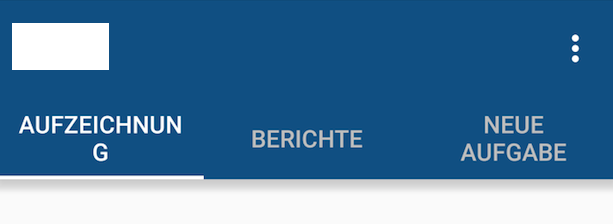
在左侧和右侧没有边距/填充,但文本被包裹。
但是当我使用app:tabMode="scrollable"我得到如下结果:

文本没有被包裹,但这是一个奇怪的边缘在右侧,我不能摆脱它。
我也尝试将tabGravity设置为app:tabGravity="center"或app:tabGravity="fill"但没有实现任何更改。
如果你们中的任何一个聪明的男人和女孩都能为我解决问题,那将会很好。
干杯,卢卡斯
这里的一个解决scheme是为每个选项卡打开自定义布局,这将使您更好地控制每个选项卡的外观。 这是通过setCustomView()方法完成的。
请注意,它将在不同的屏幕分辨率上看起来不同。
在每一个设备上看起来总是很难,但至less使用这种方法可以给你更多的控制权,因为你可以为不同的屏幕分辨率/尺寸使用不同的自定义布局xml文件。
一种方法是使字体大小尽可能大,而不会在每个屏幕大小上切断。
我有一个简单的示例工作,它将每个选项卡中的文本限制为一行,但是在这个简单的示例中,它还会导致边栏中的长文本被省略而不更改字体大小。 您的下一步将是找出每个屏幕尺寸的最佳字体大小,并为每个创build一个特定的标签布局xml。
这里是custom_tab.xml文件,指定了android:singleLine="true" :
<?xml version="1.0" encoding="utf-8"?> <LinearLayout xmlns:android="http://schemas.android.com/apk/res/android" android:orientation="vertical" android:layout_width="match_parent" android:layout_height="match_parent"> <TextView android:id="@+id/custom_text" android:layout_width="wrap_content" android:layout_height="match_parent" android:background="?attr/selectableItemBackground" android:gravity="center" android:textSize="16dip" android:textColor="#ffffff" android:singleLine="true" /> </LinearLayout>
这是MainActivity的布局:
<RelativeLayout android:id="@+id/main_layout" xmlns:android="http://schemas.android.com/apk/res/android" xmlns:app="http://schemas.android.com/apk/res-auto" xmlns:tools="http://schemas.android.com/tools" android:layout_width="match_parent" android:layout_height="match_parent" tools:context=".MainActivity"> <android.support.v7.widget.Toolbar android:id="@+id/toolbar" android:layout_width="match_parent" android:layout_height="wrap_content" android:layout_alignParentTop="true" android:background="?attr/colorPrimary" android:elevation="6dp" android:minHeight="?attr/actionBarSize" android:theme="@style/ThemeOverlay.AppCompat.Dark.ActionBar" app:popupTheme="@style/ThemeOverlay.AppCompat.Light"/> <android.support.design.widget.TabLayout android:id="@+id/tab_layout" app:tabMode="fixed" android:layout_width="match_parent" android:layout_height="wrap_content" android:layout_below="@+id/toolbar" android:background="?attr/colorPrimary" android:elevation="6dp" app:tabTextColor="#d3d3d3" app:tabSelectedTextColor="#ffffff" app:tabIndicatorColor="#ff00ff" android:minHeight="?attr/actionBarSize" /> <android.support.v4.view.ViewPager android:id="@+id/viewpager" android:layout_width="match_parent" android:layout_height="fill_parent" android:layout_below="@id/tab_layout"/> </RelativeLayout>
这里是活动代码,其中包括FragmentPagerAdapter:
public class MainActivity extends AppCompatActivity { @Override protected void onCreate(Bundle savedInstanceState) { super.onCreate(savedInstanceState); setContentView(R.layout.activity_main); Toolbar toolbar = (Toolbar) findViewById(R.id.toolbar); setSupportActionBar(toolbar); // Get the ViewPager and set it's PagerAdapter so that it can display items ViewPager viewPager = (ViewPager) findViewById(R.id.viewpager); PagerAdapter pagerAdapter = new PagerAdapter(getSupportFragmentManager(), MainActivity.this); viewPager.setAdapter(pagerAdapter); // Give the TabLayout the ViewPager TabLayout tabLayout = (TabLayout) findViewById(R.id.tab_layout); tabLayout.setupWithViewPager(viewPager); // Iterate over all tabs and set the custom view for (int i = 0; i < tabLayout.getTabCount(); i++) { TabLayout.Tab tab = tabLayout.getTabAt(i); tab.setCustomView(pagerAdapter.getTabView(i)); } } class PagerAdapter extends FragmentPagerAdapter { String tabTitles[] = new String[] { "Aufzeichnung", "Berichte", "Neue Aufgabe", }; Context context; public PagerAdapter(FragmentManager fm, Context context) { super(fm); this.context = context; } @Override public int getCount() { return tabTitles.length; } @Override public Fragment getItem(int position) { switch (position) { case 0: return new BlankFragment(); case 1: return new BlankFragment(); case 2: return new BlankFragment(); } return null; } @Override public CharSequence getPageTitle(int position) { // Generate title based on item position return tabTitles[position]; } public View getTabView(int position) { View tab = LayoutInflater.from(MainActivity.this).inflate(R.layout.custom_tab, null); TextView tv = (TextView) tab.findViewById(R.id.custom_text); tv.setText(tabTitles[position]); return tab; } } }
这里是上面的代码的结果:
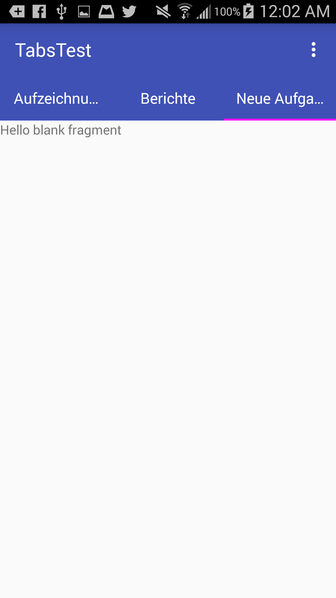
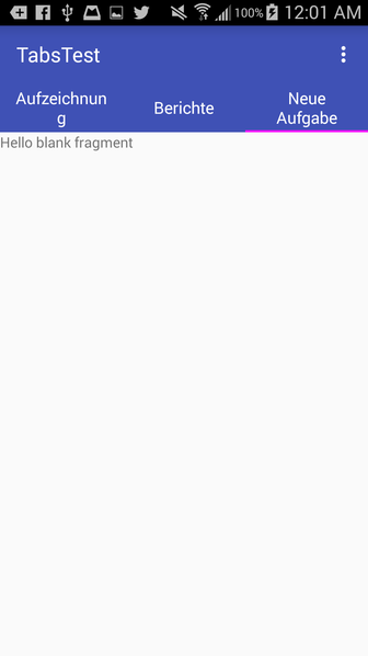
请注意,如果您删除android:singleLine="true" ,它看起来像这样,类似于你的问题:
这里有一个快速的黑客,比使用setCustomView()短很多android:theme在你的TabLayout上使用android:theme属性:
<android.support.design.widget.TabLayout android:id="@+id/tab_layout" android:layout_width="match_parent" android:layout_height="wrap_content" android:theme="@style/TabLayout_Theme" app:tabMode="fixed"/>
然后在您的主题XML中:
<style name="TabLayout_Theme" parent="@style/AppTheme"> <item name="android:singleLine">true</item> </style>
我们必须这样做,因为不幸的是android:singleLine属性在app:tabTextAppearance设置的app:tabTextAppearance被忽略。 app:tabTextAppearance实际上仅用于更改文本大小。
在标题标题中显示“…”将不会产生良好的UI体验我build议您将tabmode设置为可滚动,并让标题标题占用他们想要的空间。
<android.support.design.widget.TabLayout android:id="@+id/htab_tabs" android:layout_width="wrap_content" android:layout_height="?attr/actionBarSize" android:layout_gravity="bottom" app:tabIndicatorColor="@android:color/white" app:tabMode="scrollable" />
在您的布局XML中,如果您使用TextView ,请使用android:maxLines="1"或android:singleLine="true"查看是否有效。 如果不是TextView那么请把你的xml放在这里。
如果它是一个选项,你可以使用RelativeLayout来设置标签的中心位置,通过设置android:layout_centerHorizontal =“true”
这会在左右两边给你一个相等的余地。
例如
<RelativeLayout android:layout_width="match_parent" android:layout_height="wrap_content"> <android.support.design.widget.TabLayout android:id="@+id/tabs" android:layout_centerHorizontal="true" android:layout_width="wrap_content" android:layout_height="wrap_content" app:tabMode="scrollable" /> </RelativeLayout>
通过将样式分配给app:tabTextAppearance来解决我的问题
<android.support.design.widget.TabLayout android:layout_width="match_parent" android:layout_height="wrap_content" app:tabTextAppearance="@style/MyCustomTabTextAppearance">
样式:
<style name="MyCustomTabTextAppearance" parent="@style/AppTheme"> <item name="android:singleLine">true</item> <item name="android:textSize">@dimen/_5sdp</item> </style>
你也可以设置textSize。
