如何使用html5和(canvas或svg)绘制网格
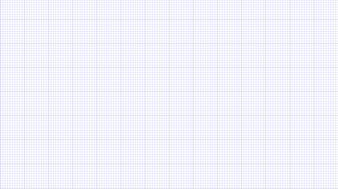
我想绘制如图所示的网格,但我完全不知道我应该从哪里开始。 我应该使用SVG还是应该使用HTML5的 Canvas以及如何绘制它。
请在此指导。 我想要这个网格绘制矩形,圆形或其他图上,我将计算该图的面积,如方形区域。
SVG可以很好的使用模式:
<svg width="100%" height="100%" xmlns="http://www.w3.org/2000/svg"> <defs> <pattern id="smallGrid" width="8" height="8" patternUnits="userSpaceOnUse"> <path d="M 8 0 L 0 0 0 8" fill="none" stroke="gray" stroke-width="0.5"/> </pattern> <pattern id="grid" width="80" height="80" patternUnits="userSpaceOnUse"> <rect width="80" height="80" fill="url(#smallGrid)"/> <path d="M 80 0 L 0 0 0 80" fill="none" stroke="gray" stroke-width="1"/> </pattern> </defs> <rect width="100%" height="100%" fill="url(#grid)" /> </svg>
我将width和height设置为100% ,因此您可以定义使用的实际宽度和高度,对于内联SVG:
<div style="width:400px;height:300px"> <svg width="100%" height="100%" xmlns="http://www.w3.org/2000/svg"> <defs> <pattern id="smallGrid" width="8" height="8" patternUnits="userSpaceOnUse"> <path d="M 8 0 L 0 0 0 8" fill="none" stroke="gray" stroke-width="0.5"/> </pattern> <pattern id="grid" width="80" height="80" patternUnits="userSpaceOnUse"> <rect width="80" height="80" fill="url(#smallGrid)"/> <path d="M 80 0 L 0 0 0 80" fill="none" stroke="gray" stroke-width="1"/> </pattern> </defs> <rect width="100%" height="100%" fill="url(#grid)" /> </svg> </div>
或<img>元素:
<img src="grid.html" width="700" height="200"/>
结果是:
<img src="grid.html" width="241" height="401"/>
结果是
请注意,对于这个特定的网格,如果您希望网格的开始和结束时间较长,则必须使用nx 80 + 1 (其中n为任意整数)的宽度和高度。
我张贴我的代码使用canvas在这里,但我也在JSFiddle 这里创build一个工作示例。
<!DOCTYPE html> <html> <head> <title>StackOverflow test bed</title> <script type="text/javascript"> function drawGrid() { var cnv = document.getElementById("cnv"); var gridOptions = { minorLines: { separation: 5, color: '#00FF00' }, majorLines: { separation: 30, color: '#FF0000' } }; drawGridLines(cnv, gridOptions.minorLines); drawGridLines(cnv, gridOptions.majorLines); return; } function drawGridLines(cnv, lineOptions) { var iWidth = cnv.width; var iHeight = cnv.height; var ctx = cnv.getContext('2d'); ctx.strokeStyle = lineOptions.color; ctx.strokeWidth = 1; ctx.beginPath(); var iCount = null; var i = null; var x = null; var y = null; iCount = Math.floor(iWidth / lineOptions.separation); for (i = 1; i <= iCount; i++) { x = (i * lineOptions.separation); ctx.moveTo(x, 0); ctx.lineTo(x, iHeight); ctx.stroke(); } iCount = Math.floor(iHeight / lineOptions.separation); for (i = 1; i <= iCount; i++) { y = (i * lineOptions.separation); ctx.moveTo(0, y); ctx.lineTo(iWidth, y); ctx.stroke(); } ctx.closePath(); return; } </script> </head> <body onload="drawGrid()"> <canvas id="cnv" width="500" height="500"></canvas> </body> </html>
使用canvas方法,可以通过更改separation参数使网格大小dynamic化。
但是,如果你的网格大小是静态的,我觉得也许你不需要绘制网格。 只是为了向用户显示一个网格,您可以使用CSS来重复背景图像,如小提琴演示中所示。 这也将是页面性能良好。
使用canvas很容易,这就是我的build议。 我在这里的移动设备上快速响应,但即使下面的psuedocode不是完全正确的,你也应该明白:
你会有一个像这样的循环:
// "Ctx" is your canvas context // "Width," "Height," and other vars that start with a capital letter are set according // to your canvas size or preference var i; for (i=0; i < Height; i += GridSize) { ctx.lineWidth(1.0+((i%10)==0)); ctx.moveTo(0,i); ctx.lineTo(Width,i); ctx.stroke(); } for (i=0; i < Width; i += GridSize) { ctx.lineWidth(1.0+((i%10)==0)); ctx.moveTo(i,0); ctx.lineTo(i,Height); ctx.stroke(); }
为了覆盖范围,基于CSS的方法如何?
<!DOCTYPE html> <html> <head> <style> html { height: 100%; } body { margin: 0; padding: 0; height: 100%; background-color: #434343; background-size: 75px 75px; background-image: linear-gradient(0deg, transparent 24%, rgba(255, 255, 255, .05) 25%, rgba(255, 255, 255, .05) 26%, transparent 27%, transparent 74%, rgba(255, 255, 255, .05) 75%, rgba(255, 255, 255, .05) 76%, transparent 77%, transparent), linear-gradient(90deg, transparent 24%, rgba(255, 255, 255, .05) 25%, rgba(255, 255, 255, .05) 26%, transparent 27%, transparent 74%, rgba(255, 255, 255, .05) 75%, rgba(255, 255, 255, .05) 76%, transparent 77%, transparent); } canvas { width:100%; height:100%; position:absolute; background-color: transparent; background-size: 15px 15px; background-image: linear-gradient(0deg, transparent 24%, rgba(255, 255, 255, .05) 25%, rgba(255, 255, 255, .05) 26%, transparent 27%, transparent 74%, rgba(255, 255, 255, .05) 75%, rgba(255, 255, 255, .05) 76%, transparent 77%, transparent), linear-gradient(90deg, transparent 24%, rgba(255, 255, 255, .05) 25%, rgba(255, 255, 255, .05) 26%, transparent 27%, transparent 74%, rgba(255, 255, 255, .05) 75%, rgba(255, 255, 255, .05) 76%, transparent 77%, transparent); } </style> </head> <body> <canvas></canvas> </body> </html>
