弹性基础flexbox中的100%:Firefox的全高,而不是Chrome
我想要一列任意数量的div,每个div的宽度为100%,高度为100%,因此最初可以看到一列,而其他列则向下溢出。 我已经设置的div有flex: 0 0 100%; ,在父div的内部display: flex和flex-direction: column来实现这一点。
父div本身具有未知高度,所以它也是display: flex的子display: flex和flex-direction: column ,设置为flex: 1 0 0以获取其容器中的剩余空间。
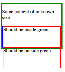
在Firefox的输出是我想要的:
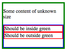
但是,不是在Chrome中:
如何在Chrome中实现Firefox的风格,没有Javascript?
您可以在http://plnkr.co/edit/WnAcmwAPnFaAhqqtwhLL?p=preview以及带有flex-direction: row的相应版本中看到这一点,该flex-direction: row可以在Firefox和Chrome中始终如一地运行。
作为参考,完整的CSS
.wrapper { display: flex; flex-direction: column; height: 150px; width: 200px; border: 4px solid green; margin-bottom: 20px; } .column-parent { flex: 1 0 0; display: flex; flex-direction: column; border: 2px solid blue; } .column-child { flex: 0 0 100%; border: 2px solid red; }
和HTML
<div class="wrapper"> <p>Some content of unknown size</p> <div class="column-parent"> <div class="column-child"> Should be inside green </div> <div class="column-child"> Should be outside green </div> </div> </div>
正如Abhitalks的回应所述,Chrome在这里处理高度属性的方式有一个错误(或对标准的不同解释)。
我发现一个在Chrome FF和IE中都可以使用的黑客
唯一的问题是,你需要有像孩子一样多的规则。
诀窍是将flex-direction设置为row,将flex-basis(即现在的宽度)设置为100%,然后转换元素
.container { border: solid 2px blue; height: 200px; width: 200px; display: flex; flex-direction: column; position: relative; } .filler { border: solid 1px black; flex: 0 0 80px; background-color: lightgreen; transition: flex 1s; } .container:hover .filler { flex: 0 0 40px; } .test { border: solid 1px red; flex: 1 0 25px; display: flex; flex-direction: row; position: relative; } .child { background-color: rgba(200, 0, 0, 0.26); flex: 0 0 100%; } .child:nth-child(2) { background-color: rgba(255, 255, 0, 0.48); transform: translateX(-100%) translateY(100%); } .child:nth-child(3) { background-color: rgba(173, 216, 230, 0.28); transform: translateX(-200%) translateY(200%); }
<div class="container"> <div class="filler"></div> <div class="filler"></div> <div class="test"> <div class="child">1</div> <div class="child">2</div> <div class="child">3</div> </div> </div>
这似乎是Chrome的一个错误。 类似于这里报告的(问题428049) ,也许涉及(问题346275) 。
这说 :
 - 浏览器应该解决flex项目的孩子的百分比,*如果* flex-basis是明确的。
 - 壁虎是*总是*解决百分比,无论基于弹性。
 -  Chrome从未*parsing百分比,无论基于弹性。
总而言之,Chrome并没有解决Flex项目的子项上的百分比高度( 即使这个子项本身是一个flex项目 ),而所有其他的浏览器都这么做。
这可以在下面的代码片段中演示:( 小提琴在这里 )
* { box-sizing: border-box; margin: 0; padding: 0; } div.wrap { height: 120px; width: 240px; margin: 0px 12px; border: 1px solid blue; float: left; display: flex; flex-direction: column; } div.parent { flex: 0 0 100%; border: 1px solid green; display: flex; flex-direction: column; } div.item { flex: 0 0 100%; border: 1px solid red; }
<div class="wrap"> <div class="item">a</div> <div class="item">b</div> <div class="item">c</div> </div> <div class="wrap"> <div class="parent"> <div class="item">a</div> <div class="item">b</div> <div class="item">c</div> </div> </div>
我以前的回答是一个利用特定的布局设置的黑客。
绕过这个Chrome bug的另一种方式是使用布局中的中间元素,并使用top:0px和bottom:0px来设置这个元素的大小。 (而不是高度:100%)Chrome处理微积分的方式仍然存在一个错误,那就是需要一个假animation来使其正确调整
.container { border: solid 2px blue; height: 200px; width: 200px; display: flex; flex-direction: column; position: relative; } .filler { border: solid 1px black; flex: 0 0 94px; background-color: lightgreen; transition: 1s; } .container:hover .filler { flex: 0 0 50px; } .test { border: solid 1px red; flex: 1 0 25px; display: flex; flex-direction: row; position: relative; } @-webkit-keyframes adjust2 { 0% {flex-basis: 100%;} 100% {flex-basis: 100.1%;} } .child { background-color: rgba(200, 0, 0, 0.26); width: 100%; height: 100%; flex: 1 0 100%; -webkit-animation: adjust2 1s infinite; /* only needed for webkit bug */ } .intermediate { width: 100%; position: absolute; top: 0px; bottom: 0px; display: flex; flex-direction: column; } .child:nth-child(n+2) { background-color: rgba(255, 255, 0, 0.48); } .child:nth-child(n+3) { background-color: rgba(173, 216, 230, 0.28); }
<div class="container"> <div class="filler"></div> <div class="test"> <div class="intermediate"> <div class="child"></div> <div class="child"></div> <div class="child"></div> </div> </div> </div>
怎么样join100%的容器:
.column-parent { flex: 1 0 100%; }
并且在不调整flex基础的情况下flex-grow在1中被包含的元素:
.column-child { flex: 1 0 0; }
以下是它的外观: http : //plnkr.co/edit/H25NQxLtbi65oaltNVax?p=preview
