如何使用CSS(和JavaScript?)创build一个模糊的“磨砂”背景?
我正在尝试用HTML5,CSS3和JavaScript来创build一个可以在webkit浏览器上工作的iOS 7风格的磨砂外观。
从技术上讲,给以下的HTML:
<style> #partial-overlay { width: 100%; height: 20px; background: rgba(255, 255, 255, .2); /* TODO frost */ position: fixed; top: 0; left: 0; } </style> <div id="main-view"> <div style="width: 50px; height: 50px; background: #f00"></div> To my left is a red box<br> Now there is just text<br> Text that goes on for a few pixels <br> or even more </div> <div id="partial-overlay"> Here is some content </div> 我想应用像-webkit-filter: blur(5px)到#main-view水平的#main-view一个20px的东西。
如果CSS被修改为#partial-overlay { width: 20px; height: 100%; ...} #partial-overlay { width: 20px; height: 100%; ...} #partial-overlay { width: 20px; height: 100%; ...}那么我需要将-webkit-filter: blur(5px)垂直应用到第一个20像素。
显而易见的解决scheme是使用JavaScript来克隆#main-view ,设置overflow: hidden ,然后根据需要更改宽度/高度,但这似乎很难归纳为更复杂的页面/ CSS结构。
有一个更好的方法来实现这个最小的性能命中和最大普遍性?
编辑 :这是我想要实现的一个例子: 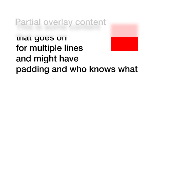
感谢您的灵感…它使我的这个canvas插件这个伎俩
新增function和改进function: -webkit-和Firefox工作示例 ,现在可重新定义/stream畅。
JS
$(document).ready(function () { frost = function () { var w = $('#main-view').width(); html2canvas(document.body, { onrendered: function (canvas) { document.body.appendChild(canvas); $('canvas').wrap('<div id="contain" />'); }, width: w, height: 30 }); $('canvas, #partial-overlay, #cover').hide(); $('#cover').fadeIn('slow', function () { $('#partial-overlay').fadeIn('slow'); }); }; $('body').append('<div id="cover"></div><svg id="svg-image-blur"><filter id="blur-effect-1"><feGaussianBlur stdDeviation="2"/></filter></svg>'); $('#main-view').click(function () { frost(); $('#partial-overlay').addClass('vis'); $(window).resize(function () { $('canvas, #partial-overlay, #cover').hide(); }); function onResize() { if ($('#partial-overlay').hasClass('vis')) { frost(); } } var timer; $(window).bind('resize', function () { timer && clearTimeout(timer); timer = setTimeout(onResize, 50); }); }); $('#partial-overlay').click(function () { $('#partial-overlay').removeClass('vis'); $('canvas, #partial-overlay, #cover').hide(); }); });
CSS
#main-view { width:75%; height:50%; box-sizing: border-box; margin:8px; } #partial-overlay { display:none; width: 100%; height: 20px; position: absolute; top: 0; left: 0; z-index:99; background: rgba(255, 255, 255, 0.2); cursor:pointer; } canvas { position: absolute; top: 0; left: 0; -webkit-filter:blur(5px); filter: url(#blur-effect-1); } #cover { display:none; height:19px; width:100%; background:#fff; top:0; left:0; position:absolute; } #contain { height:20px; width:100%; overflow:hidden; position:absolute; top:0; left:0; } svg { height:0; width:0; }
HTML
<div id="main-view"> <div style="width: 10%; height: 20%; background: #f00; float: left"></div>To my left is a red box <br>Now there is just text <br>Text that goes on for a few pixels <br>or even more</div> <div id="partial-overlay">Here is some content</div>
我把它放在一个点击函数中,因为我认为这将是最有可能的用例。 它将在文档准备就绪的同时工作。
虽然canvasperformance不会像素完美,但我不认为它在大多数情况下真的很重要,因为它是模糊的。
更新:按要求现在这是可以改变的。 我还将封面div移入JS,并为Firefox添加了一个svg版本。 resize需要在每个重新resize时重新绘制canvas,所以我将其设置为在resize时隐藏canvas,覆盖等,然后在重新大小停止时将其replace。
基本上你可以有一个覆盖占位符,你复制的主要内容和同步滚动的两个div,比叠加应用CSS模糊filter只。
一个简单的JavaScript将做到:
$(document).ready(function(){ $('.overlay').append( $('.content').html() ); $('.content').on('scroll', function(){ $('.overlay').scrollTop($(this).scrollTop()); }); });
而对于CSS:
.overlay { overflow:hidden; -webkit-filter: blur(.25em); background:#fff; }
我为您整理了一个工作示例(仅限webkit):
玩的开心! 🙂
有一个更好的方法来实现这个最小的性能命中和最大普遍性?
答案是否定的 。
原因是为了做你想做的事情,你需要直接访问用于浏览器窗口的位图来提取或操纵你想要模糊的区域的像素(我希望浏览器中的“aero”可以看起来很漂亮整洁……),或者是一个filter,它适用于你应用的元素后面(或者可以有一个限制区域)。
由于没有本地支持(除了canvas和扩展API,或者是一个从html生成canvas图像的库 – >相对较慢),在这两种情况下,这都需要进行欺骗(图像,分割div等) 。
如果你在页面上做了所有的事情,你可以做很多有趣的事情,但是你也需要执行布局,更新,过滤等等,所以你会回来没有非优化,因为Javascript比本地(更不用说这很容易出错)。
直到浏览器允许你抓取一个窗口的一部分作为一个canvas(从来没有?因为这将需要在该页面上的一切都是同源的或具有特殊的接受头设置的内容)是没有办法,只能做技巧。
更新
作为一个演示,你可以通过使用html2canvas等,但必须使用妥协( – >性能低下),演示是粗糙的,实验性的,需要调整才能正常工作 – 但仅仅为了演示:
http://jsfiddle.net/AbdiasSoftware/RCaLR/
结果:
广义的函数来抓取背景的一部分:
getBlurredBG(x, y, width, height, id);
使用html2canvas获取窗口的一部分:
function getBlurredBG(x, y, w, h, id) { html2canvas(document.body, { onrendered: function (canvas) { process(canvas, x, y, w, h, id); }, width: (x + w), height: (y + h) }); }
处理内容:
function process(canvas, x, y, w, h, id) { //create new canvas to enable clipping //As html2canvas returns a canvas from 0,0 to width and height //we need to clip it. var ocanvas = document.createElement('canvas'); ocanvas.width = w; ocanvas.height = h; ocanvas.style.left = x + 'px'; ocanvas.style.top = y + 'px'; ocanvas.style.position = 'absolute'; ocanvas.id = id; var ctx = ocanvas.getContext('2d'); ctx.drawImage(canvas, x, y, w, h, 0, 0, w, h); stackBlurCanvasRGB(ocanvas, x, y, w, h, 28) lighten(ocanvas); ctx.fillStyle = 'rgba(255,255,255,0.5)'; ctx.fillRect(x, y, w, h); ctx.fillStyle = '#999'; ctx.font = '32px arial'; ctx.fillText("Partial overlay content", 10, 60); document.body.appendChild(ocanvas); }
最近,一个新的-webkit-backdrop-filter 。 目前在Safari 9.0中支持这个function,并且Chrome在一个标志后面。
演示:
#blurred { -webkit-backdrop-filter: blur(10px); width: 200px; height: 100px; position: fixed; top: 50px; left: 50px; border: 3px solid white; }
<img src="https://upload.wikimedia.org/wikipedia/commons/e/eb/Ash_Tree_-_geograph.org.uk_-_590710.jpg"> <div id="blurred"> Blurred </div>
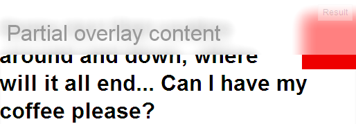
我做了什么样的生活样本(并更新为上图)
码:
<style> #partial-overlay { width: 100%; height: 45px; background: #ffffff; /* TODO frost */ -webkit-opacity:0.70; -webkit-filter: blur(5px); position: absolute; top: 20px; left: 0px; z-index:5; } #main-view { position: fixed; top: 20px; left: 80px; z-index:-1; } </style> <div id="main-view"> <div style="width: 50px; height: 50px; background: #f00; position:fixed; left:10px; top: 40px; -webkit-filter: blur(2px); "></div> <div style="width: 80px; height: 60px; background: #fff; position:fixed; left:0px; top: 66px; -webkit-filter: blur(5px);"></div> <div style="width: 50px; height: 30px; background: #f00; position:fixed; left:10px; top: 60px;"></div> <p style="font-family:Sans, Arial, Verdana;"> To my left is a red box<br> Now there is just text<br> Text that goes on for a few pixels <br> or even more </p> </div> <div id="partial-overlay"> </div>
我使它看起来比它需要更漂亮一点,但它的工作原理!
我做了一些没有backdrop-filter CSS技巧,因为默认情况下chrome不支持
我原来的代码与sass : https : //codepen.io/mixal_bl4/pen/EwPMWo
$(()=>{ let sdm = $('.some-draggable-modal'); sdm.center().draggable(); }); jQuery.fn.center = function () { this.css("position","absolute"); this.css("top", Math.max(0, (($(window).height() - $(this).outerHeight()) / 2) + $(window).scrollTop()) + "px"); this.css("left", Math.max(0, (($(window).width() - $(this).outerWidth()) / 2) + $(window).scrollLeft()) + "px"); return this; };
body { background: -webkit-repeating-linear-gradient(135deg, #fff, #fff 25px, #e2edc1 25px, #e2edc1 50px) fixed; background: repeating-linear-gradient(-45deg, #fff, #fff 25px, #e2edc1 25px, #e2edc1 50px) fixed; background-attachment: fixed; background-size: cover; } html:before, body:before { content: ""; display: block; position: absolute; top: 0; left: 0; right: 0; bottom: 0; background: rgba(0, 0, 0, 0.3); } html .some-draggable-modal, body .some-draggable-modal { width: 150px; height: 150px; border: 1px solid lime; display: -webkit-box; display: -ms-flexbox; display: flex; place-content: center; -webkit-box-orient: vertical; -webkit-box-direction: normal; -ms-flex-direction: column; flex-direction: column; text-align: center; border-radius: 6px; cursor: move; position: relative; overflow: hidden; } html .some-draggable-modal .title, body .some-draggable-modal .title { position: relative; z-index: 1; color: black; } html .some-draggable-modal:before, body .some-draggable-modal:before { content: ""; position: absolute; top: 0; left: 0; right: 0; bottom: 0; background: -webkit-repeating-linear-gradient(135deg, #fff, #fff 25px, #e2edc1 25px, #e2edc1 50px) fixed; background: repeating-linear-gradient(-45deg, #fff, #fff 25px, #e2edc1 25px, #e2edc1 50px) fixed; background-attachment: fixed; background-size: cover; } html .some-draggable-modal:hover:before, body .some-draggable-modal:hover:before { -webkit-filter: blur(2px); filter: blur(2px); } html .some-draggable-modal:hover:after, body .some-draggable-modal:hover:after { content: "filter: blur(2px)"; position: absolute; left: 0; right: 0; bottom: 10px; color: green; }
<script src="jquery-3.2.1.min.js"></script> <script src="//cdnjs.cloudflare.com/ajax/libs/jqueryui/1.12.1/jquery-ui.min.js"></script> <div class="some-draggable-modal"> <span class="title">You can drag me :)</span> </div>
不幸的是,没有这样做的好方法,因为你发现你将需要一个主div的副本:
<div class="wrapper"> <div class="overlay"></div> <div id="main-copy"></div> </div>
Overlay会将包装宽度推到一边,而main-copy将会在模糊的背景中。 如果主副本中的内容很复杂,那么显然会出现性能问题。
它的支持仍然非常有限(只有Firefox),但有一种方法可以得到它:
Firefox只演示
CSS很简单:
#partial-overlay { width:400px; height:100px; background: -moz-element(#main-view); top: 0px; left: 200px; position: absolute; opacity: 0.3; }
关键是用作部分覆盖主视图元素的背景。
此演示仅使用不透明度,因为filter不适用于Firefox。
背景的元素属性已经被W3C批准,所以可以在webkit中的某个时候显示出来
在演示中,部分重叠已经转移到更清楚的是什么是什么的权利
