灰度背景Css图像
我在网上search了很多,但我找不到一个跨浏览器的解决scheme,褪色的CSS背景图像灰度和回来。
唯一的工作解决scheme是应用CSS3滤镜灰度:
-webkit-filter: grayscale(100%); 但是这只适用于Chrome v.15 +和Safari v.6 +(如您在这里看到的: http ://css3.bradshawenterprises.com/filters/)
网上有很多网页提到这个解决scheme,
filter: url("data:image/svg+xml;utf8,<svg xmlns=\'http://www.w3.org/2000/svg\'><filter id=\'grayscale\'><feColorMatrix type=\'matrix\' values=\'0.3333 0.3333 0.3333 0 0 0.3333 0.3333 0.3333 0 0 0.3333 0.3333 0.3333 0 0 0 0 0 1 0\'/></filter></svg>#grayscale"); /* Firefox 10+, Firefox on Android */ filter: gray; /* IE6-9 */
(正如你可以看到这里: http : //www.karlhorky.com/2012/06/cross-browser-image-grayscale-with-css.html )
但实际上,它似乎并不适用于CSS的背景图像,如webkitfilter。
有没有解决scheme(也许用jQuery?)来破解这种缺乏对不太高级的浏览器上的筛选器的支持?
干得好:
<html xmlns="http://www.w3.org/1999/xhtml"> <head runat="server"> <title>bluantinoo CSS Grayscale Bg Image Sample</title> <style type="text/css"> div { border: 1px solid black; padding: 5px; margin: 5px; width: 600px; height: 600px; float: left; color: white; } .grayscale { background: url(yourimagehere.jpg); -moz-filter: url("data:image/svg+xml;utf8,<svg xmlns=\'http://www.w3.org/2000/svg\'><filter id=\'grayscale\'><feColorMatrix type=\'matrix\' values=\'0.3333 0.3333 0.3333 0 0 0.3333 0.3333 0.3333 0 0 0.3333 0.3333 0.3333 0 0 0 0 0 1 0\'/></filter></svg>#grayscale"); -o-filter: url("data:image/svg+xml;utf8,<svg xmlns=\'http://www.w3.org/2000/svg\'><filter id=\'grayscale\'><feColorMatrix type=\'matrix\' values=\'0.3333 0.3333 0.3333 0 0 0.3333 0.3333 0.3333 0 0 0.3333 0.3333 0.3333 0 0 0 0 0 1 0\'/></filter></svg>#grayscale"); -webkit-filter: grayscale(100%); filter: gray; filter: url("data:image/svg+xml;utf8,<svg xmlns=\'http://www.w3.org/2000/svg\'><filter id=\'grayscale\'><feColorMatrix type=\'matrix\' values=\'0.3333 0.3333 0.3333 0 0 0.3333 0.3333 0.3333 0 0 0.3333 0.3333 0.3333 0 0 0 0 0 1 0\'/></filter></svg>#grayscale"); } .nongrayscale { background: url(yourimagehere.jpg); } </style> </head> <body> <div class="nongrayscale"> this is a non-grayscale of the bg image </div> <div class="grayscale"> this is a grayscale of the bg image </div> </body> </html>
testing它在FireFox,Chrome和IE。 我还附上了一张图片来显示我的实施结果。 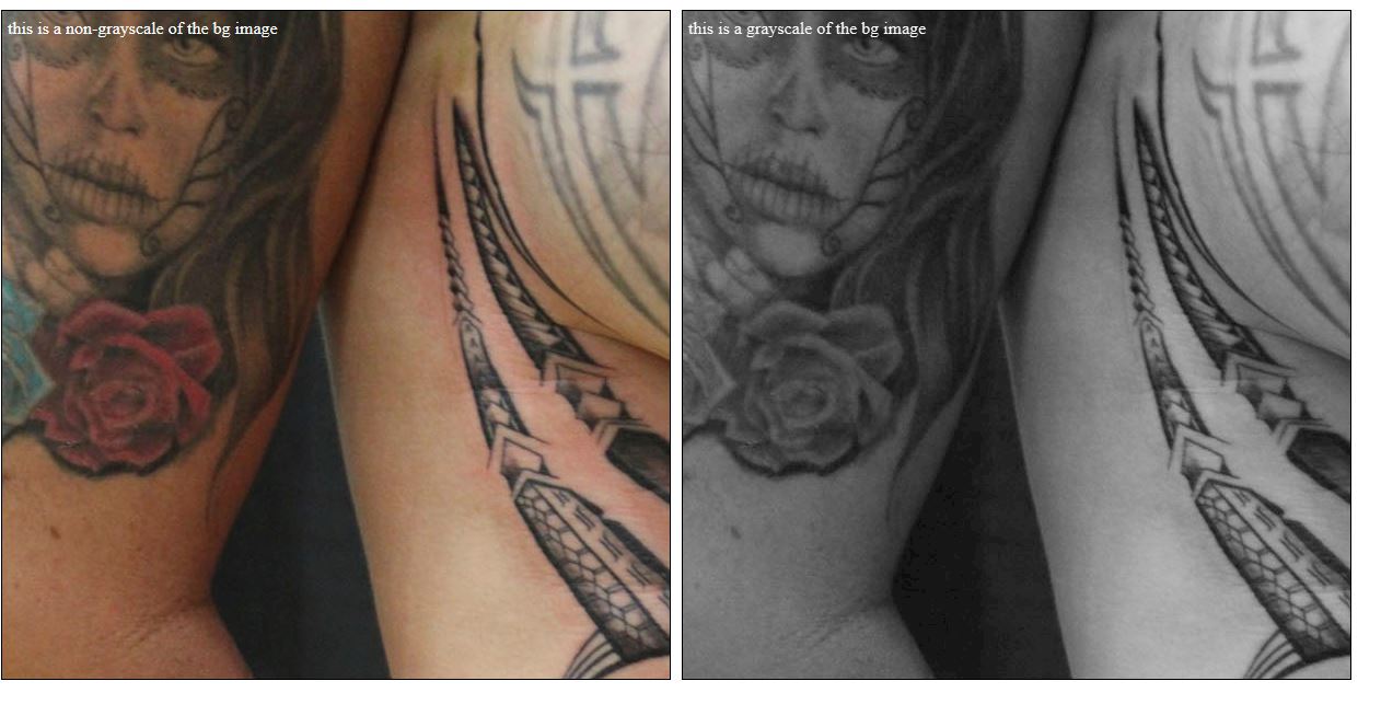
编辑:此外,如果你想图像只是来回切换与jQuery,这里的页面源代码…我已经包括networking链接到jQuery和图像在线,所以你应该能够复制/粘贴testing出来:
<html xmlns="http://www.w3.org/1999/xhtml"> <head runat="server"> <title>bluantinoo CSS Grayscale Bg Image Sample</title> <script src="http://code.jquery.com/jquery-1.11.0.min.js"></script> <style type="text/css"> div { border: 1px solid black; padding: 5px; margin: 5px; width: 600px; height: 600px; float: left; color: white; } .grayscale { background: url(http://www.polyrootstattoo.comhttp://img.dovov.comArtists/Buda/40.jpg); -moz-filter: url("data:image/svg+xml;utf8,<svg xmlns=\'http://www.w3.org/2000/svg\'><filter id=\'grayscale\'><feColorMatrix type=\'matrix\' values=\'0.3333 0.3333 0.3333 0 0 0.3333 0.3333 0.3333 0 0 0.3333 0.3333 0.3333 0 0 0 0 0 1 0\'/></filter></svg>#grayscale"); -o-filter: url("data:image/svg+xml;utf8,<svg xmlns=\'http://www.w3.org/2000/svg\'><filter id=\'grayscale\'><feColorMatrix type=\'matrix\' values=\'0.3333 0.3333 0.3333 0 0 0.3333 0.3333 0.3333 0 0 0.3333 0.3333 0.3333 0 0 0 0 0 1 0\'/></filter></svg>#grayscale"); -webkit-filter: grayscale(100%); filter: gray; filter: url("data:image/svg+xml;utf8,<svg xmlns=\'http://www.w3.org/2000/svg\'><filter id=\'grayscale\'><feColorMatrix type=\'matrix\' values=\'0.3333 0.3333 0.3333 0 0 0.3333 0.3333 0.3333 0 0 0.3333 0.3333 0.3333 0 0 0 0 0 1 0\'/></filter></svg>#grayscale"); } .nongrayscale { background: url(http://www.polyrootstattoo.comhttp://img.dovov.comArtists/Buda/40.jpg); } </style> <script type="text/javascript"> $(document).ready(function () { $("#image").mouseover(function () { $(".nongrayscale").removeClass().fadeTo(400,0.8).addClass("grayscale").fadeTo(400, 1); }); $("#image").mouseout(function () { $(".grayscale").removeClass().fadeTo(400, 0.8).addClass("nongrayscale").fadeTo(400, 1); }); }); </script> </head> <body> <div id="image" class="nongrayscale"> rollover this image to toggle grayscale </div> </body> </html>
编辑2(对于IE10-11用户):上述解决scheme将不适用于Microsoft最近对浏览器所做的更改,因此,这是一个更新的解决scheme,可让您对图像进行灰度(或降低饱和度)。
<svg> <defs> <filter xmlns="http://www.w3.org/2000/svg" id="desaturate"> <feColorMatrix type="saturate" values="0" /> </filter> </defs> <image xlink:href="http://www.polyrootstattoo.comhttp://img.dovov.comArtists/Buda/40.jpg" width="600" height="600" filter="url(#desaturate)" /> </svg>
使用当前的浏览器,你可以像这样使用它:
img { -webkit-filter: grayscale(100%); /* Chrome, Safari, Opera */ filter: grayscale(100%); }
并对其进行补救:
img:hover{ -webkit-filter: grayscale(0%); /* Chrome, Safari, Opera */ filter: grayscale(0%); }
和我一起工作的时间要短得多。 在CSS中还有更多可以做的事情:
filter: none | blur() | brightness() | contrast() | drop-shadow() | grayscale() | hue-rotate() | invert() | opacity() | saturate() | sepia() | url();
有关更多信息和支持浏览器,请参阅: http : //www.w3schools.com/cssref/css3_pr_filter.asp
你真的不需要使用复杂的编码!
灰度hover:
-webkit-filter:灰度(100%);
灰度“hover”:
-webkit-filter:灰度(0%);
我只是让我的CSS类有一个单独的hover类,并添加在第二个灰度。 如果你真的不喜欢复杂性,那真的很简单。
你也可以使用:
img{ filter:grayscale(100%); } img:hover{ filter:none; }
