HTML中的CSS colspan
我试图构build一个类似于以下的布局:
+---+---+---+ | | | | +---+---+---+ | | +-----------+ 底部填满上排的空间。
如果这是一个实际的表格,我可以很容易地用<td colspan="3"> ,但是因为我只是创build一个类似于表格的布局 ,我不能使用<table>标签。 这可能使用CSS?
colspan没有简单,优雅的CSS模拟。
在这个问题上search将返回各种解决scheme,包括一系列的替代品,包括绝对定位,大小,以及类似的各种浏览器和环境的具体警告。 阅读,并根据您的发现做出最明智的决定。
据我所知,在CSS中没有colspan,但是在不久的将来会有多栏布局的column-span ,但是因为它只是CSS3的草稿,所以可以在这里查看 。 无论如何,你可以做一个解决方法使用div和span像这样的表格式的显示。
这将是HTML:
<div class="table"> <div class="row"> <span class="cell red first"></span> <span class="cell blue fill"></span> <span class="cell green last"></span> </div> </div> <div class="table"> <div class="row"> <span class="cell black"></span> </div> </div>
这将是CSS:
/* this is to reproduce table-like structure for the sake of table-less layout. */ .table { display:table; table-layout:fixed; width:100px; } .row { display:table-row; height:10px; } .cell { display:table-cell; } /* this is where the colspan tricks works. */ span { width:100%; } /* below is for visual recognition test purposes only. */ .red { background:red; } .blue { background:blue; } .green { background:green; } .black { background:black; } /* this is the benefit of using table display, it is able to set the width of it's child object to fill the rest of the parent width as in table */ .first { width: 20px; } .last { width: 30px; } .fill { width: 100%; }
使用这个技巧的唯一理由是为了获得table-layout行为的好处,如果只将div和跨度宽度设置为一定的百分比并不足以满足我们的devise要求,我会使用它。
但是如果你不需要从table-layout行为中受益,那么durilai的回答就足够了。
<div style="width: 100%;"> <div style="float: left; width: 33%;">Row 1 - Cell 1</div> <div style="float: left; width: 34%;">Row 1 - Cell 2</div> <div style="float: left; width: 33%;">Row 1 - Cell 3</div> </div> <div style="clear: left; width: 100%;"> Row 2 - Cell 1 </div>
这不是CSS的一部分。 colspan描述了页面内容的结构,或者给表格中的数据提供了一些含义,这是HTML的工作。
另一个build议是使用flexbox而不是表格。 这当然是一个“现代浏览器”的东西,但是来吧,这是2016年)
对于那些正在寻找答案的人来说,至less这可能是一个替代解决scheme,因为原来的post是从2010年开始的。
这里有一个很好的指导: https : //css-tricks.com/snippets/css/a-guide-to-flexbox/
.table { border: 1px solid red; padding: 2px; max-width: 300px; display: flex; flex-flow: row wrap; } .table-cell { border: 1px solid blue; flex: 1 30%; } .colspan-3 { border: 1px solid green; flex: 1 100%; }
<div class="table"> <div class="table-cell"> row 1 - cell 1 </div> <div class="table-cell"> row 1 - cell 2 </div> <div class="table-cell"> row 1 - cell 3 </div> <div class="table-cell colspan-3"> row 2 - cell 1 (spans 3 columns) </div> </div>
你可以尝试使用网格系统,如http://960.gs/
你的代码会是这样的,假设你使用“12列”布局:
<div class="container_12"> <div class="grid_4">1</div><div class="grid_4">2</div><div class="grid_4">3</div> <div class="clear"></div> <div class="grid_12">123</div> </div>
column-span: all; /* W3C */ -webkit-column-span: all; /* Safari & Chrome */ -moz-column-span: all; /* Firefox */ -ms-column-span: all; /* Internet Explorer */ -o-column-span: all; /* Opera */
http://www.quackit.com/css/css3/properties/css_column-span.cfm
尝试添加display: table-cell; width: 1%; display: table-cell; width: 1%; 到你的表单元素。
.table-cell { display: table-cell; width: 1%; padding: 4px; border: 1px solid #efefef; }
<div class="table"> <div class="table-cell">one</div> <div class="table-cell">two</div> <div class="table-cell">three</div> <div class="table-cell">four</div> </div> <div class="table"> <div class="table-cell">one</div> <div class="table-cell">two</div> <div class="table-cell">three</div> <div class="table-cell">four</div> </div> <div class="table"> <div class="table-cell">one</div> </div>
如果使用div和span,那么当datagrid-table行数量更多时,它将占用更多的代码大小。 以下代码在所有浏览器中都被选中
HTML:
<div id="gridheading"> <h4>Sl.No</h4><h4 class="big">Name</h4><h4>Location</h4><h4>column</h4><h4>column</h4><h4>column</h4><h4>Amount(Rs)</h4><h4>View</h4><h4>Edit</h4><h4>Delete</h4> </div> <div class="data"> <h4>01</h4><h4 class="big">test</h4><h4>TVM</h4><h4>A</h4><h4>I</h4><h4>4575</h4><h4>4575</h4></div> <div class="data"> <h4>01</h4><h4 class="big">test</h4><h4>TVM</h4><h4>A</h4><h4>I</h4><h4>4575</h4><h4>4575</h4></div>
CSS:
#gridheading { background: #ccc; border-bottom: 1px dotted #BBBBBB; font-size: 12px; line-height: 30px; text-transform: capitalize; } .data { border-bottom: 1px dotted #BBBBBB; display: block; font-weight: normal; line-height: 20px; text-align: left; word-wrap: break-word; } h4 { border-right: thin dotted #000000; display: table-cell; margin-right: 100px; text-align: center; width: 100px; word-wrap: break-word; } .data .big { margin-right: 150px; width: 200px; }
你总是可以position:absolute; 东西并指定宽度。 这不是一个非常stream畅的做法,但它会工作。
我创造了这个小提琴:
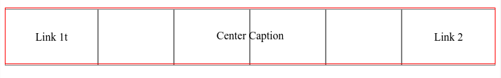
http://jsfiddle.net/wo40ev18/3/
HTML
<div id="table"> <div class="caption"> Center Caption </div> <div class="group"> <div class="row"> <div class="cell">Link 1t</div> <div class="cell"></div> <div class="cell"></div> <div class="cell"></div> <div class="cell"></div> <div class="cell ">Link 2</div> </div> </div>
CSS
#table { display:table; } .group {display: table-row-group; } .row { display:table-row; height: 80px; line-height: 80px; } .cell { display:table-cell; width:1%; text-align: center; border:1px solid grey; height: 80px line-height: 80px; } .caption { border:1px solid red; caption-side: top; display: table-caption; text-align: center; position: relative; top: 80px; height: 80px; height: 80px; line-height: 80px; }
媒体查询类可以用来实现通过重复标记的东西。 这是我用bootstrap的方法:
<tr class="total"> <td colspan="1" class="visible-xs"></td> <td colspan="5" class="hidden-xs"></td> <td class="focus">Total</td> <td class="focus" colspan="2"><%= number_to_currency @cart.total %></td> </tr>
用于移动的colspan 1,用CSS进行工作的其他用户。
