居中一个没有宽度的div块
当我尝试将div块“产品”居中时,我遇到了一个问题,因为我不知道div宽度。 任何人都有解决scheme?
更新:我有的问题是我不知道我会显示多less产品,我可以有1,2或3产品,我可以居中,如果它是一个固定的数字,因为我知道父母的宽度div,我只是不知道如何做内容是dynamic的。
.product_container { text-align: center; height: 150px; } .products { height: 140px; text-align: center; margin: 0 auto; clear: ccc both; } .price { margin: 6px 2px; width: 137px; color: #666; font-size: 14pt; font-style: normal; border: 1px solid #CCC; background-color: #EFEFEF; } <div class="product_container"> <div class="products" id="products"> <div id="product_15"> <img src="http://img.dovov.comecommerce/card_default.png"> <div class="price">R$ 0,01</div> </div> <div id="product_15"> <img src="http://img.dovov.comecommerce/card_default.png"> <div class="price">R$ 0,01</div> </div> <div id="product_15"> <img src="http://img.dovov.comecommerce/card_default.png"> <div class="price">R$ 0,01</div> </div> </div> </div>
更新2015年2月27日:我原来的答案不断得到投票,但现在我通常使用@ bobince的方法。
.child { /* This is the item to center... */ display: inline-block; } .parent { /* ...and this is its parent container. */ text-align: center; }
我原来的历史用途:
你可能想尝试这种方法。
<div class="product_container"> <div class="outer-center"> <div class="product inner-center"> </div> </div> <div class="clear"/> </div>
这是匹配的风格:
.outer-center { float: right; right: 50%; position: relative; } .inner-center { float: right; right: -50%; position: relative; } .clear { clear: both; }
的jsfiddle
这里的想法是,你包含你想要在两个div,一个外部和一个内部中心的内容。 你浮动两个div,使他们的宽度自动缩小,以适应您的内容。 接下来,您将相对于容器中心的右边缘放置在相对位置。 最后,将内部div的相对位置相对于其自身宽度的一半(实际上是外部div的宽度,但它们是相同的)。 最终,将内容集中在任何容器中。
如果您依靠“产品”内容来调整“product_container”的高度,则可能需要最后一个空的div。
具有“display:block”的元素(默认为div)的宽度由其容器的宽度决定。 您不能根据其内容的宽度来制作块的宽度(缩小到适合)。
(除了CSS 2.1中'float:left / right'的块外,这对于居中是没有用的。)
您可以将“display”属性设置为“inline-block”,以将块转换为可由其父级的文本alignment属性控制的缩小到适合的对象,但浏览器支持是不确定的。 如果你想这样做的话,你可以通过使用黑客(例如,参见-moz-inline-stack)来获得更多信息。
另一种方式是桌子。 如果您的列的宽度实际上无法预先知道,这可能是必要的。 我无法真正知道你要从示例代码中做什么 – 没有什么明显的需要缩小到合适的块 – 但产品列表可能被视为表格。
[PS。 不要在网页上使用“pt”作为字体大小。 如果你真的需要固定大小的文本,'px'更可靠,否则相对单位'%'更好。 和“清楚:ccc都是” – 一个错字?]
.center{ text-align:center; } .center > div{ /* NB child combinators don't work in IE6 or less */ display:inline-block; }
的jsfiddle
大多数浏览器都支持display: table; CSS规则。 这是一个很好的技巧,将一个div放在一个容器中而不添加额外的HTML,也不会向容器应用约束样式(如text-align: center;将所有其他内联内容置于容器中),同时保持容器的dynamic宽度DIV:
HTML:
<div class="container"> <div class="centered">This content is centered</div> </div>
CSS:
.centered { display: table; margin: 0 auto; }
.container { background-color: green; } .centered { display: table; margin: 0 auto; background-color: red; }
<div class="container"> <div class="centered">This content is centered</div> </div>
我发现一个更优雅的解决scheme,结合“内联块”,以避免使用浮动和哈克清晰:两者。 它仍然需要嵌套divs tho,这不是很有意思,但它只是工作…
div.outer{ display:inline-block; position:relative; left:50%; } div.inner{ position:relative; left:-50%; }
希望它有帮助!
四种方式皮肤猫:
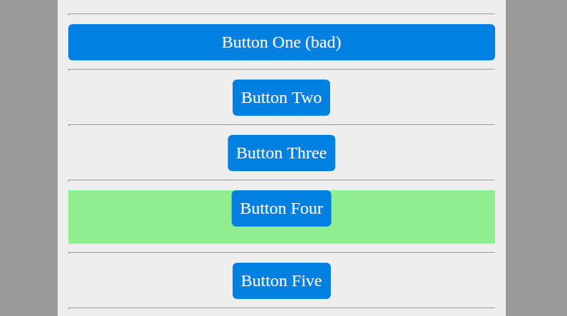
button一:任何types的display: block将承担全部父母的宽度。 真正。 不好的例子。
button2:进行display: inline-block将导致自动(而不是全部)宽度。 然后,您可以使用text-align: center 在包裹块上 。 可能是最简单和最广泛兼容的,即使是“复古”的浏览器…
.wrapTwo text-align: center; .two display: inline-block; // instantly shrinks width
button3:不需要在包装上放置任何东西。 所以也许这是最优雅的解决scheme。 也垂直工作。 (浏览器对transtlate的支持很好(≥IE9) …)。
position: relative; display: inline-block; // instantly shrinks width left: 50%; transform: translateX(-50%);
顺便说一句:也是一个垂直居中未知高度块(与绝对定位有关)的好方法。
button4:绝对定位。 只要确保在包装中保留足够的高度,因为没有其他人会(无论是clearfix或隐式…)
.four position absolute top 0 left 50% transform translateX(-50%) .wrapFour position relative // otherwise, absolute positioning will be relative to page! height 50px // ensure height background lightgreen // just a marker
button5:最后:浮动(这也带来块级元素dynamic宽度)和相对移位。 虽然我从来没有在野外看到过这个。 也许有缺点…
.wrapFive &:after // aka 'clearfix' content '' display table clear both .five float left position relative left 50% transform translateX(-50%)
→完整的源代码(手写笔语法)
默认情况下, div元素显示为块元素,因此它们具有100%的宽度,使得它们无意义。 正如Arief所build议的那样,您必须指定width ,然后在指定margin以便居中div时可以使用auto 。
另外,你也可以强制display: inline ,但是你会有一些行为像一个span而不是一个div ,所以没有多大意义。
这将以一个元素(例如有序列表或无序列表)或任何元素为中心。 只需用outerElement的类来包装它,然后给InnerElement的内部元素。
IE浏览器,老Mozilla浏览器,以及大多数较新的浏览器。
.outerElement { display: -moz-inline-stack; display: inline-block; vertical-align: middle; zoom: 1; position: relative; left: 50%; } .innerElement { position: relative; left: -50%; }
<div class="outer"> <div class="target"> <div class="filler"> </div> </div> </div> .outer{ width:100%; height: 100px; } .target{ position: absolute; width: auto; height: 100px; left: 50%; transform: translateX(-50%); } .filler{ position:relative; width:150px; height:20px; }
如果目标元素是绝对定位的,您可以通过在一个方向上移动50%( left: 50% ),然后在相反方向上将其转换50%( transform:translateX(-50%) )来居中。 这工作没有定义目标元素的宽度(或width:auto )。 父元素的位置可以是静态的,绝对的,相对的或固定的。
使用css3 flexbox with justify-content:center;
<div class="row"> <div class="col" style="background:red;">content1</div> <div class="col" style="">content2</div> </div> .row { display: flex; /* equal height of the children */ height:100px; border:1px solid red; width: 400px; justify-content:center; }
恐怕没有明确指定宽度的唯一方法是使用(gasp)表。
Mike M. Lin的回答略有差异
如果你添加overflow: auto; (或hidden ) div.product_container ,那么你不需要div.clear 。
这是来自这篇文章 – > http://www.quirksmode.org/css/clearing.html
这里是修改的HTML:
<div class="product_container"> <div class="outer-center"> <div class="product inner-center"> </div> </div> </div>
这里是修改后的CSS:
.product_container { overflow: auto; /* width property only required if you want to support IE6 */ width: 100%; } .outer-center { float: right; right: 50%; position: relative; } .inner-center { float: right; right: -50%; position: relative; }
原因是,为什么没有div.clear更好(除了有一个空元素感觉不对头)是Firefox过度的边缘分配。
例如,如果你有这个html:
<div class="product_container"> <div class="outer-center"> <div class="product inner-center"> </div> </div> <div style="clear: both;"></div> </div> <p style="margin-top: 11px;">Some text</p>
那么在Firefox(写作时为8.0)时,您将在 product_container 之前看到11px边距。 更糟糕的是,即使内容很好地适合屏幕尺寸,您也将获得整个页面的垂直滚动条。
试试这个新的CSS和标记
这里是修改过的HTML:
<div class="product_container"> <div class="products" id="products"> <div id="product_15" class="products_box"> <img src="http://img.dovov.comecommerce/card_default.png"> <div class="price">R$ 0,01</div> </div> <div id="product_15" class="products_box"> <img src="http://img.dovov.comecommerce/card_default.png"> <div class="price">R$ 0,01</div> </div> <div id="product_15" class="products_box"> <img src="http://img.dovov.comecommerce/card_default.png"> <div class="price">R$ 0,01</div> </div> </div>
这里是修改后的CSS:
<pre> .product_container { text-align: center; height: 150px; } .products { left: 50%; height:35px; float:left; position: relative; margin: 0 auto; width:auto; } .products .products_box { width:auto; height:auto; float:left; right: 50%; position: relative; } .price { margin: 6px 2px; width: 137px; color: #666; font-size: 14pt; font-style: normal; border: 1px solid #CCC; background-color: #EFEFEF; }
<div class="product_container"> <div class="outer-center"> <div class="product inner-center"> </div> </div> <div class="clear"></div> </div> .outer-center { float: right; right: 50%; position: relative; } .inner-center { float: right; right: -50%; position: relative; } .clear { clear: both; } .product_container { overflow:hidden; }
如果您不提供“.product_container”的“overflow:hidden”,则“outer-center”div将与其右边的其他内容重叠。 “外中心”右侧的任何链接或button将无法正常工作。 尝试使用“outer-center”的背景颜色来理解“overflow:hidden”的需要
我发现有趣的解决scheme,我正在制作滑块,并不得不中心幻灯片控制,我做到了这一点,工作正常。 您也可以将相对位置添加到父项并将子项位置垂直移动。 看一下http://jsfiddle.net/bergb/6DvJz/
CSS:
#parent{ width:600px; height:400px; background:#ffcc00; text-align:center; } #child{ display:inline-block; margin:0 auto; background:#fff; }
HTML:
<div id="parent"> <div id="child">voila</div> </div>
做display:table; 并设置margin为auto
重要的代码位
.relatedProducts { display: table; margin-left: auto; margin-right: auto; }
无论你现在有多less元素,它会自动alignment在中心
代码片段中的示例:
.relatedProducts { display: table; margin-left: auto; margin-right: auto; } a { text-decoration:none; }
<div class="row relatedProducts"> <div class="homeContentTitle" style="margin: 100px auto 35px; width: 250px">Similar Products</div> <a href="#">test1 </a> <a href="#">test2 </a> <a href="#">test3 </a> </div>
蹩脚的修复,但它确实工作…
CSS:
#mainContent { position:absolute; width:600px; background:#FFFF99; } #sidebar { float:left; margin-left:610px; max-width:300; background:#FFCCCC; } #sidebar{ text-align:center; }
HTML:
<center> <table border="0" cellspacing="0"> <tr> <td> <div id="mainContent"> 1<br/> <br/> 123<br/> 123<br/> 123<br/> </div><div id="sidebar"><br/> </div></td> </tr> </table> </center>
简单的修复工作在旧的浏览器(但使用表,并要求设置高度):
<div style="width:100%;height:40px;position:absolute;top:50%;margin-top:-20px;"> <table style="width:100%"><tr><td align="center"> In the middle </td></tr></table> </div>
<style type="text/css"> .container_box{ text-align:center } .content{ padding:10px; background:#ff0000; color:#ffffff;
}
使用跨越内部divs
<div class="container_box"> <span class="content">Hello</span> </div>
我知道这个问题已经很老了,但是我正在采取一些措施。 非常类似于bobince的回答,但是有工作代码的例子。
使每个产品成为一个内联块。 居中容器的内容。 完成。
http://jsfiddle.net/rgbk/6Z2Re/
<style> .products{ text-align:center; } .product{ display:inline-block; text-align:left; background-image: url('http://www.color.co.uk/wp-content/uploads/2013/11/New_Product.jpg'); background-size:25px; padding-left:25px; background-position:0 50%; background-repeat:no-repeat; } .price { margin: 6px 2px; width: 137px; color: #666; font-size: 14pt; font-style: normal; border: 1px solid #CCC; background-color: #EFEFEF; } </style> <div class="products"> <div class="product"> <div class="price">R$ 0,01</div> </div> <div class="product"> <div class="price">R$ 0,01</div> </div> <div class="product"> <div class="price">R$ 0,01</div> </div> <div class="product"> <div class="price">R$ 0,01</div> </div> <div class="product"> <div class="price">R$ 0,01</div> </div> <div class="product"> <div class="price">R$ 0,01</div> </div> </div>
另请参阅: 在CSS中使用dynamic宽度居中嵌套块
我的解决scheme是:
.parent { display: flex; flex-wrap: wrap; } .product { width: 240px; margin-left: auto; height: 127px; margin-right: auto; }
添加这个CSS到你的product_container类
margin: 0px auto; padding: 0px; border:0; width: 700px;
