有没有可能用CSS创build这个形状(两个部分圆形连接在一起)?
我试图用CSS来完成两个div的边界:
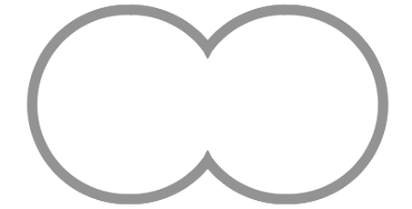
我尝试使用border-radius ,但两个部分圆不会压在一起: http : //jsfiddle.net/uwz6L79w/
.left { position: absolute; left: 0; top: 0; width: 100px; height: 100px; border-width: 4px; border-color: black white black black; border-style: solid; border-radius: 60px } .right { position: absolute; left: 104px; top: 0; width: 100px; height: 100px; border-width: 4px; border-color: black black black white; border-style: solid; border-radius: 60px; }
<div class="left"></div> <div class="right"></div>
我可以将它们进一步压在一起,但是我必须有一个div与另一个重叠,像这样: http : //jsfiddle.net/uwz6L79w/1/ 。
.left { position: absolute; left: 0; top: 0; width: 100px; height: 100px; border-width: 4px; border-color: black white black black; border-style: solid; border-radius: 60px } .right { position: absolute; left: 70px; top: 0; width: 100px; height: 100px; border-width: 4px; border-color: black black black white; border-style: solid; border-radius: 60px; background: #f2f2f2; }
<div class="left"></div> <div class="right"></div>
有没有人知道我可以做到这一点,而没有divs重叠?
SVG
这也可以使用SVG。
SVG版本很短,主要只需要一个Arc命令来控制它的形状,大小和位置。
<svg width="50%" viewbox="0 0 100 50"> <path d="M50,35 a20,20 0 1,0 0,-20 a20,20 0 1,0 0,20z" fill="white" stroke="black"> </path> </svg>
使用边界: 推荐
你可以像在你的第二个代码片段中一样使用它,并像下面的代码片段一样使用定位来避免两个div元素重叠。 这里的圆圈是由伪元素产生的,重叠的部分是用overflow: hidden方式剪掉的overflow: hidden在父母身上。
这里需要注意的一点是,任何hover效果都应该添加到伪元素而不是父元素上。 这是因为如果将:hover在父级上,那么即使将:hoverhover在圆圈外(因为父级仍然是方块),它也会被触发。
在这个答案中提供的所有三个解决scheme中,这是最好的浏览器支持,即使在IE8也能工作。 因此,这是推荐的。
.left, .right { position: relative; float: left; height: 200px; width: 200px; /* border: 1px solid; uncomment to see that they aren't overlapped */ overflow: hidden; } .left:after, .right:after { position: absolute; content: ''; height: calc(100% - 12px); /* 12px because of 6px border on either side */ width: calc(100% - 12px); /* 12px because of 6px border on either side */ border-radius: 50%; border: 6px solid gray; } .left:after { right: -20px; } .right:after { left: -20px; }
<div class='left'></div> <div class='right'></div>
这是一个只使用一个<div>的解决scheme。
-
.shape是一个带有10px红色边框的透明圆。 -
.shape::before是一个带有10px红色边框的不透明白色圆圈。 -
.shape::after是一个不透明的白色圆圈(无边框)。
.shape { margin: 6px auto; } .shape, .shape::before, .shape::after { display: block; position: relative; width: 160px; height: 160px; border-radius: 160px; } .shape, .shape::before { border: 10px solid #f00; } .shape::before, .shape::after { content: ""; background-color: rgba(255, 255, 255, 1); } .shape::before { top: -10px; left: -150px; } .shape::after { top: -180px; }
<div class="shape"> </div>
这是我想出的一个简单例子。 我没有在不同的浏览器上testing它,但应该得到很好的支持。
HTML:
<div class="one"></div> <div class="two"></div>
CSS:
div { background: #fff; border-radius: 50%; float: left; height: 100px; position: relative; width: 100px; } .one:after, .two:after{ /* adjust this to set the border color */ background: #666; border-radius: 50%; content: ""; position: absolute; z-index: -1; /* adjust these to set the border width */ top: -5px; right: -5px; bottom: -5px; left: -5px; } .two { /* adjust this to set the overlap of the circles */ margin-left: -20px; }
现场演示
我回到了这个问题(6周后),纯粹是因为这个顶尖的答案引起了我对svg学术好奇心,这是我很less遇到的,从来没有花时间去学习。
由于我现在正在学习svg ,所以这个问题(这个问题让我首先学习了这个问题)似乎是尝试一些新技能的理想挑战。
所以这里是一个替代的 svg解决scheme,相当于我上面的单个<div> css解决scheme:
svg { width: 310px; height: 180px; } svg circle { stroke: rgb(255,0,0); stroke-width: 10; fill: rgb(255,255,255); } svg circle:nth-of-type(3) { stroke: rgb(255,255,255); }
<svg viewbox="0 0 310 180"> <circle cx="90" cy="90" r="80" /> <circle cx="220" cy="90" r="80" /> <circle cx="90" cy="90" r="70" /> </svg>
