CSS z-index悖论花
我想通过z-index CSS属性创build一个自相矛盾的效果。
在我的代码中,我有五个圆圈,如下图所示,它们都是绝对定位的,没有定义z-index 。 因此,默认情况下,每个圆都与前一个圆重叠。
现在,圈5与圈1(左图)重叠。 我想要达到的悖论是同时在圈2下和圈5顶部圈1(如右图)。
1.jpg
这是我的代码
标记:
<div class="item i1">1</div> <div class="item i2">2</div> <div class="item i3">3</div> <div class="item i4">4</div> <div class="item i5">5</div>
CSS
.item { width: 50px; height: 50px; line-height: 50px; border: 1px solid red; background: silver; border-radius: 50%; text-align: center; } .i1 { position: absolute; top: 30px; left: 0px; } .i2 { position: absolute; top: 0px; left: 35px; } .i3 { position: absolute; top: 30px; left: 65px; } .i4 { position: absolute; top: 70px; left: 50px; } .i5 { position: absolute; top: 70px; left: 15px; }
http://jsfiddle.net/Kx2k5/也提供一个现场示例。
我尝试了很多堆叠命令,堆叠上下文等技巧。 我读了一些关于这些技术的文章,但没有成功。 我该如何解决这个问题?
这是我的尝试: http : //jsfiddle.net/Kx2k5/1/
(在Fx27 , Ch33 , IE9 , Sf5.1.10和Op19上成功testing)
CSS
.item { /* include borders on width and height */ -webkit-box-sizing : border-box; -moz-box-sizing : border-box; box-sizing : border-box; ... } .i1:after { content: ""; /* overlap a circle over circle #1 */ position : absolute; z-index : 1; top : 0; left : 0; height : 100%; width : 100%; /* inherit border, background and border-radius */ background : inherit; border-bottom : inherit; border-radius : inherit; /* only show the bottom area of the pseudoelement */ clip : rect(35px 50px 50px 0); }
基本上我已经重叠了一个:after第一个圆的伪元素:after (inheritance了一些属性),然后我用clip()属性修剪了它,所以我只让它的底部部分可见(其中圆#1与圆#5重叠)。
对于我在这里使用的CSS属性,这个例子甚至应该在IE8上工作( box-sizing , clip() , inherit ,并且支持伪元素)
结果效果的屏幕截图

我的尝试也使用clip 。 这个想法是要有一半的一半。 这样设置z-index将工作。
所以你可以将顶部设置为z-index: -1 ,底部设置为z-index: 1 。
结果:

.item { width: 50px; height: 50px; line-height: 50px; border: 1px solid red; background: silver; border-radius: 50%; text-align: center; } .under { z-index: -1; } .above { z-index: 1; overflow: hidden; clip: rect(30px 50px 60px 0); } .i1 { position: absolute; top: 30px; left: 0px; } .i2 { position: absolute; top: 0px; left: 35px; } .i3 { position: absolute; top: 30px; left: 65px; } .i4 { position: absolute; top: 70px; left: 50px; } .i5 { position: absolute; top: 70px; left: 15px; }
<div class="item i1 under">1</div> <div class="item i1 above">1</div> <div class="item i2">2</div> <div class="item i3">3</div> <div class="item i4">4</div> <div class="item i5">5</div>
这是我的。
我也使用位于第一个圆的顶部的伪元素,而不是使用剪辑,我保持其背景透明,只是给它一个内嵌的阴影,匹配的圆圈(银)的背景颜色以及一个红色边框覆盖圆圈边界的右下方。
演示
CSS(不同于起点)
.i1 { position: absolute; top: 30px; left: 0px; &:before { content: ''; position: absolute; z-index: 100; top: 0; left: 0; width: 50px; height: 50px; border-radius: 50%; box-shadow: inset 5px -5px 0 6px silver; border-bottom: solid 1px red; } }
完成品 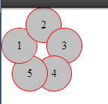
可悲的是,以下只是一个理论上的答案,由于某些原因我不能得到-webkit-transform-style: preserve-3d; 工作(不得不犯一些明显的错误,但似乎无法弄清楚)。 无论哪种方式,在阅读你的问题之后,我就像每一个悖论一样,想知道为什么这只是一种明显的不可能性,而不是真正的不可能性。 再过几秒钟,我意识到在现实生活中,叶子会旋转一点,从而允许这样的事物存在。 所以我想编写一个简单的技术演示,但没有以前的属性是不可能的(它被绘制到平坦的父层)。 无论哪种方式,这里都是基本代码
<div class="container"> <div> <div class="i1 leaf"> <div class="item">1</div> </div> <div class="i2 leaf"> <div class="item">2</div> </div> <div class="i3 leaf"> <div class="item">3</div> </div> <div class="i4 leaf"> <div class="item">4</div> </div> <div class="i5 leaf"> <div class="item">5</div> </div> </div> </div>
和CSS:
.i1 { -webkit-transform:rotateZ(288deg) } .i2 { -webkit-transform:rotateZ(0deg) } .i3 { -webkit-transform:rotateZ(72deg) } .i4 { -webkit-transform:rotateZ(144deg) } .i5 { -webkit-transform:rotateZ(216deg) } .leaf { position:absolute; left:35px; top:35px; } .leaf > .item { -webkit-transform:rotateY(30deg) translateY(35px) }
你可以在这里find完整的代码 。
JS小提琴
HTML
<div class="item i1">1</div> <div class="item i2">2</div> <div class="item i3">3</div> <div class="item i4">4</div> <div id="five">5</div> <div class="item2 i5"></div> <div class="item3 i6"></div>
CSS
.item { width: 50px; height: 50px; line-height: 50px; border: 1px solid red; background: silver; border-radius: 50%; text-align: center; } .item2 { width: 25px; height: 50px; line-height: 50px; border: 1px solid red; border-right: none; border-radius: 50px 0 0 50px; background: silver 50%; background-size: 25px; text-align: center; z-index: -3; } .item3 { width: 25px; height: 50px; line-height: 50px; border: 1px solid red; border-left: none; border-radius: 0 50px 50px 0; background: silver 50%; background-size: 25px; text-align: center; } .i1 { position: absolute; top: 30px; left: 0px; } .i2 { position: absolute; top: 0px; left: 35px; } .i3 { position: absolute; top: 30px; left: 65px; } .i4 { position: absolute; top: 70px; left: 55px; } .i5 { position: absolute; top: 70px; left: 15px; } .i5 { position: absolute; top: 72px; left:19px; } .i6 { position: absolute; top: 72px; left: 44px; } #five { position: absolute; top: 88px; left: 40px; z-index: 100; }
JS小提琴现场演示
也适用于IE8。
HTML
<div class="half under"><div class="item i1">1</div></div> <div class="half above"><div class="item i1">1</div></div> <div class="item i2">2</div> <div class="item i3">3</div> <div class="item i4">4</div> <div class="item i5">5</div>
CSS
.item { width: 50px; height: 50px; line-height: 50px; border: 1px solid red; background: silver; border-radius: 50%; text-align: center; } .half { position: absolute; overflow: hidden; width: 52px; height: 26px; line-height: 52px; text-align: center; } .half.under { top: 30px; left: 0px; z-index: -1; border-radius: 90px 90px 0 0; } .half.above { top: 55px; left: 0px; z-index: 1; border-radius: 0 0 90px 90px; } .half.above .i1 { margin-top:-50%; } .i2 { position: absolute; top: 0px; left: 35px;} .i3 { position: absolute; top: 30px; left: 65px;} .i4 { position: absolute; top: 70px; left: 50px; } .i5 { position: absolute; top: 70px; left: 15px; }
