使用CSS转换旋转表格标题文本
这看起来应该是可能的,如下所示:
.verticalText { /* IE-only DX filter */ writing-mode: tb-rl; filter: flipv fliph; /* Safari/Chrome function */ -webkit-transform: rotate(270deg); /* works in latest FX builds */ -moz-transform: rotate(270deg); } 这在IE中工作。
它在Safari,Chrome和FX中以奇怪的方式出错 – 单元格的大小在文本旋转之前计算!
这里是一个演示: http : //jsfiddle.net/HSKws/
我使用dynamic图像作为解决方法,虽然这也有其问题 。 我很高兴,作为一个倒退,但似乎应该有一种方法来使这个CSS的工作 – 几乎在那里。
任何人都知道一种方法,使转换后的细胞适应内容?
“变换”会改变您声明的整个元素的方向,而不是其中的文本内容。 这更像是IE的“matrix”属性而不是“写作模式”。
至关重要的是,转换元素不会改变其内容大小的计算方式(或其父级的布局如何受该大小的影响)。 CSS的垂直和水平尺寸algorithm是不同的,难以适应; 没有真正的一致的方式,他们可以适应任意旋转的内容。 所以'变换'就像是使用'position:relative':它会改变内容的渲染位置,但不会改变布局的大小。
所以如果你想在表格中包括一个,你需要明确地设置单元格的“高度”,以适应预期的旋转“宽度”。 如果您事先不知道,也许可能会用JavaScript来破解它。
FWIW:对于我在Fx3.1b3上,跨度也像其他的一样旋转。 但是,在具有横向反锯齿function(ClearType)的Windows上,渲染看起来不太好……渲染良好的图像可能会更好。
可以在XHTML文档中使用内联SVG(我只testingSafari和Firefox):
<html xmlns="http://www.w3.org/1999/xhtml"> <body> <table border="1"> <tr> <td> </td> <td> <svg xmlns="http://www.w3.org/2000/svg" width="16" height="150"> <text id="thetext" transform="rotate(270, 12, 0) translate(-140,0)">Example column header</text> </svg> </td> <td> <svg xmlns="http://www.w3.org/2000/svg" width="16" height="150"> <text id="thetext" transform="rotate(270, 12, 0) translate(-140,0)">Example column header</text> </svg> </td> <td> <svg xmlns="http://www.w3.org/2000/svg" width="16" height="150"> <text id="thetext" transform="rotate(270, 12, 0) translate(-140,0)">Example column header</text> </svg> </td> </tr> <tr> <td>Example row header</td> <td>1</td> <td>2</td> <td>3</td> </tr> </table> </body> </html>
不幸的是,你必须明确地设置你的表格单元格的宽度和高度,以及使用SVG渲染的文本的翻译。 另外,文件扩展名必须是xhtml 。
Webkit增加了:
-webkit-writing-mode:vertical-rl;
你可以申请到一个div 。
正如我在类似的问题上回答的 ,我使用David Votrubec的jQuery插件和Mike在博客文章下的评论来解决这个问题 。
把它放在一个.js文件中:
(function ($) { $.fn.rotateTableCellContent = function (options) { /* Version 1.0 7/2011 Written by David Votrubec (davidjs.com) and Michal Tehnik (@Mictech) for ST-Software.com */ var cssClass = ((options) ? options.className : false) || "vertical"; var cellsToRotate = $('.' + cssClass, this); var betterCells = []; cellsToRotate.each(function () { var cell = $(this) , newText = cell.text() , height = cell.height() , width = cell.width() , newDiv = $('<div>', { height: width, width: height }) , newInnerDiv = $('<div>', { text: newText, 'class': 'rotated' }); newInnerDiv.css('-webkit-transform-origin', (width / 2) + 'px ' + (width / 2) + 'px'); newInnerDiv.css('-moz-transform-origin', (width / 2) + 'px ' + (width / 2) + 'px'); newDiv.append(newInnerDiv); betterCells.push(newDiv); }); cellsToRotate.each(function (i) { $(this).html(betterCells[i]); }); }; })(jQuery);
而这在你的页面的顶部:
<script src="rotatetablecellcontent.js" type="text/javascript"></script> <script type="text/javascript"> $(document).ready(function(){ $('.yourtableclass').rotateTableCellContent(); }); </script>
而这在你的CSS:
/* Styles for rotateTableCellContent plugin*/ table div.rotated { -webkit-transform: rotate(270deg); -moz-transform: rotate(270deg); writing-mode:tb-rl; white-space: nowrap; } thead th { vertical-align: top; } table .vertical { white-space: nowrap; }
然后确保你的表具有“yourtableclass”类,并且你想旋转的所有TD都具有“vertical”类。
这是一个在jsFiddle中运行的演示 。
希望它能帮助别人,即使我迟到了两年!
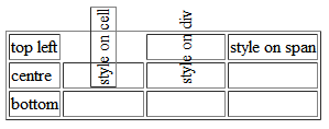
为了在你的表头中有旋转的文字:
- 将标题内容放在div中 – 旋转这些div而不是标题本身
- 设置位置:表头上的相对位置:旋转的div上的绝对位置。
- 也设置
th标头的高度
完成。
你可以在这里看到它:
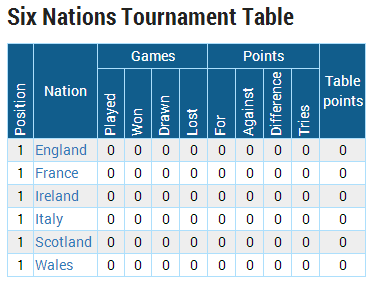
你可以在这个页面上看到,如果你让你的窗口瘦(less于1000像素,它旋转表头 – http://www.rugbydata.com/
这是我使用的代码:
div.rotatabletext { -webkit-transform: rotate(-90deg); /* Firefox */ -moz-transform: rotate(-90deg); /* IE */ -ms-transform: rotate(-90deg); /* Opera */ -o-transform: rotate(-90deg); /* Internet Explorer */ filter: progid:DXImageTransform.Microsoft.BasicImage(rotation=3); width:0px; text-align:left; height:0px; margin-left:0px; margin-top:0px; bottom:2px; position:absolute; } table.tournamentresults > * > tr > td { padding:1px; } table.tournamentresults > thead > tr:nth-child(1) > th:nth-child(1) { height:70px; position:relative; } table.tournamentresults > thead > tr:nth-child(2) th { height:70px; position:relative; }
