Android新的底部导航栏
看到新的指导方针出来了,并用于google photos最新的应用程序。 不知道如何使用新的底部导航栏。 看穿新的支持库,没有find任何的领先。

找不到任何官方示例。
如何使用新的底部栏? 不想做任何定制。
我想你可能会找这个。
下面是一个快速入门的片段:
public class MainActivity extends AppCompatActivity { private BottomBar mBottomBar; @Override protected void onCreate(Bundle savedInstanceState) { super.onCreate(savedInstanceState); // Notice how you don't use the setContentView method here! Just // pass your layout to bottom bar, it will be taken care of. // Everything will be just like you're used to. mBottomBar = BottomBar.bind(this, R.layout.activity_main, savedInstanceState); mBottomBar.setItems( new BottomBarTab(R.drawable.ic_recents, "Recents"), new BottomBarTab(R.drawable.ic_favorites, "Favorites"), new BottomBarTab(R.drawable.ic_nearby, "Nearby"), new BottomBarTab(R.drawable.ic_friends, "Friends") ); mBottomBar.setOnItemSelectedListener(new OnTabSelectedListener() { @Override public void onItemSelected(final int position) { // the user selected a new tab } }); } @Override protected void onSaveInstanceState(Bundle outState) { super.onSaveInstanceState(outState); mBottomBar.onSaveInstanceState(outState); } }
这里是参考链接。
https://github.com/roughike/BottomBar
编辑新版本。
底部导航视图已经有一段时间在材料devise准则中了,但是我们并不容易将其实现到我们的应用程序中。 一些应用程序已经构build了自己的解决scheme,而另一些则依赖于第三方开源库来完成工作。 现在,devise支持库正在看到这个底部导航栏的添加,让我们深入了解如何使用它!
如何使用 ?
首先,我们需要更新我们的依赖!
compile 'com.android.support:design:25.0.0'
deviseXML。
<?xml version="1.0" encoding="utf-8"?> <RelativeLayout xmlns:android="http://schemas.android.com/apk/res/android" xmlns:app="http://schemas.android.com/apk/res-auto" android:layout_width="match_parent" android:layout_height="match_parent"> <!-- Content Container --> <android.support.design.widget.BottomNavigationView android:id="@+id/bottom_navigation" android:layout_width="match_parent" android:layout_height="wrap_content" android:layout_alignParentBottom="true" app:itemBackground="@color/colorPrimary" app:itemIconTint="@color/white" app:itemTextColor="@color/white" app:menu="@menu/bottom_navigation_main" /> </RelativeLayout>
根据您的要求创build菜单。
<?xml version="1.0" encoding="utf-8"?> <menu xmlns:android="http://schemas.android.com/apk/res/android" xmlns:app="http://schemas.android.com/apk/res-auto"> <item android:id="@+id/action_favorites" android:enabled="true" android:icon="@drawable/ic_favorite_white_24dp" android:title="@string/text_favorites" app:showAsAction="ifRoom" /> <item android:id="@+id/action_schedules" android:enabled="true" android:icon="@drawable/ic_access_time_white_24dp" android:title="@string/text_schedules" app:showAsAction="ifRoom" /> <item android:id="@+id/action_music" android:enabled="true" android:icon="@drawable/ic_audiotrack_white_24dp" android:title="@string/text_music" app:showAsAction="ifRoom" /> </menu>
处理启用/禁用状态。 做select器文件。
<?xml version="1.0" encoding="utf-8"?> <selector xmlns:android="http://schemas.android.com/apk/res/android"> <item android:color="@color/white" android:state_enabled="true" /> <item android:color="@color/colorPrimaryDark" android:state_enabled="false" /> </selector>
处理点击事件。
BottomNavigationView bottomNavigationView = (BottomNavigationView) findViewById(R.id.bottom_navigation); bottomNavigationView.setOnNavigationItemSelectedListener( new BottomNavigationView.OnNavigationItemSelectedListener() { @Override public boolean onNavigationItemSelected(@NonNull MenuItem item) { switch (item.getItemId()) { case R.id.action_favorites: break; case R.id.action_schedules: break; case R.id.action_music: break; } return false; } });
如果你想了解更多关于它的方法和它的工作原理, 请阅读。
肯定会帮助你。
您应该使用v25 Android支持库中的BottomNavigationView。 它代表了应用程序的标准底部导航栏。
这是一个关于媒体的post,有一个一步一步的指导: https : //medium.com/@hitherejoe/exploring-the-android-design-support-library-bottom-navigation-drawer-548de699e8e0#.9vmiekxze
您还可以使用自定义选项卡视图的选项卡布局来实现此目的。
custom_tab.xml
<?xml version="1.0" encoding="utf-8"?> <LinearLayout xmlns:android="http://schemas.android.com/apk/res/android" xmlns:tools="http://schemas.android.com/tools" android:layout_width="wrap_content" android:layout_height="wrap_content" android:background="?attr/selectableItemBackground" android:gravity="center" android:orientation="vertical" android:paddingBottom="10dp" android:paddingTop="8dp"> <ImageView android:id="@+id/icon" android:layout_width="24dp" android:layout_height="24dp" android:scaleType="centerInside" android:src="@drawable/ic_recents_selector" /> <TextView android:id="@+id/title" android:layout_width="wrap_content" android:layout_height="wrap_content" android:ellipsize="end" android:maxLines="1" android:textAllCaps="false" android:textColor="@color/tab_color" android:textSize="12sp"/> </LinearLayout>
activity_main.xml中
<?xml version="1.0" encoding="utf-8"?> <LinearLayout xmlns:android="http://schemas.android.com/apk/res/android" android:layout_width="match_parent" android:layout_height="match_parent" android:orientation="vertical"> <android.support.v4.view.ViewPager android:id="@+id/view_pager" android:layout_width="match_parent" android:layout_height="0dp" android:layout_weight="1" /> <android.support.design.widget.TabLayout android:id="@+id/tab_layout" style="@style/AppTabLayout" android:layout_width="match_parent" android:layout_height="56dp" android:background="?attr/colorPrimary" /> </LinearLayout>
MainActivity.java
public class MainActivity extends AppCompatActivity { private TabLayout mTabLayout; private int[] mTabsIcons = { R.drawable.ic_recents_selector, R.drawable.ic_favorite_selector, R.drawable.ic_place_selector}; @Override protected void onCreate(Bundle savedInstanceState) { super.onCreate(savedInstanceState); setContentView(R.layout.activity_main); // Setup the viewPager ViewPager viewPager = (ViewPager) findViewById(R.id.view_pager); MyPagerAdapter pagerAdapter = new MyPagerAdapter(getSupportFragmentManager()); viewPager.setAdapter(pagerAdapter); mTabLayout = (TabLayout) findViewById(R.id.tab_layout); mTabLayout.setupWithViewPager(viewPager); for (int i = 0; i < mTabLayout.getTabCount(); i++) { TabLayout.Tab tab = mTabLayout.getTabAt(i); tab.setCustomView(pagerAdapter.getTabView(i)); } mTabLayout.getTabAt(0).getCustomView().setSelected(true); } private class MyPagerAdapter extends FragmentPagerAdapter { public final int PAGE_COUNT = 3; private final String[] mTabsTitle = {"Recents", "Favorites", "Nearby"}; public MyPagerAdapter(FragmentManager fm) { super(fm); } public View getTabView(int position) { // Given you have a custom layout in `res/layout/custom_tab.xml` with a TextView and ImageView View view = LayoutInflater.from(MainActivity.this).inflate(R.layout.custom_tab, null); TextView title = (TextView) view.findViewById(R.id.title); title.setText(mTabsTitle[position]); ImageView icon = (ImageView) view.findViewById(R.id.icon); icon.setImageResource(mTabsIcons[position]); return view; } @Override public Fragment getItem(int pos) { switch (pos) { case 0: return PageFragment.newInstance(1); case 1: return PageFragment.newInstance(2); case 2: return PageFragment.newInstance(3); } return null; } @Override public int getCount() { return PAGE_COUNT; } @Override public CharSequence getPageTitle(int position) { return mTabsTitle[position]; } } }
下载完整的示例项目
Google已经在devise支持库的版本25.0.0之后推出了BottomNavigationView。 但它具有以下限制:
- 您无法删除标题和中心图标。
- 你不能改变标题的文字大小。
- Y̶o̶u̶̶c̶a̶n̶'̶t̶̶c̶h̶a̶n̶g̶e̶̶̶̶̶̶̶̶̶̶̶̶̶̶̶̶̶̶̶̶̶̶̶̶̶̶̶̶̶̶̶̶̶̶̶̶̶̶̶̶̶̶̶̶̶̶̶̶̶̶̶̶̶̶̶̶̶̶̶̶̶̶̶̶̶̶̶̶̶̶̶̶̶̶̶̶̶̶̶̶̶̶̶̶̶̶̶̶̶̶̶̶̶̶̶̶̶̶̶̶̶̶̶̶̶̶̶̶̶̶̶̶̶̶̶̶̶̶̶̶̶̶̶̶̶̶̶̶̶̶̶̶̶̶̶̶̶̶̶̶̶̶̶̶̶̶̶̶̶̶̶̶̶̶̶̶̶̶̶̶̶̶̶̶̶̶̶̶̶̶̶̶̶̶̶̶̶̶̶̶̶̶̶̶̶̶̶̶̶̶̶̶̶̶̶̶̶̶̶̶̶̶̶̶̶̶̶̶̶̶̶̶̶̶̶̶̶̶̶̶̶̶̶̶̶̶̶̶̶̶̶̶̶̶̶̶̶̶
- 它没有BottomNavigationBehavior:所以没有通过CordinatorLayout与FAB或SnackBar集成。
- 每个menuItem是FrameLayout的一个纯粹的扩展,所以它没有任何好的圆圈显示效果
所以你可以用这个拳头版本的BottomNavigationView完成的最大function是:(没有任何reflection或自己实现的库)。

所以,如果你想要这些。 你可以使用像第三部分库像roughike / BottomBar或自己实现的lib。
其他备用库,你可以尝试: – https://github.com/Ashok-Varma/BottomNavigation
<com.ashokvarma.bottomnavigation.BottomNavigationBar android:layout_gravity="bottom" android:id="@+id/bottom_navigation_bar" android:layout_width="match_parent" android:layout_height="wrap_content"/> BottomNavigationBar bottomNavigationBar = (BottomNavigationBar) findViewById(R.id.bottom_navigation_bar); bottomNavigationBar .addItem(new BottomNavigationItem(R.drawable.ic_home_white_24dp, "Home")) .addItem(new BottomNavigationItem(R.drawable.ic_book_white_24dp, "Books")) .addItem(new BottomNavigationItem(R.drawable.ic_music_note_white_24dp, "Music")) .addItem(new BottomNavigationItem(R.drawable.ic_tv_white_24dp, "Movies & TV")) .addItem(new BottomNavigationItem(R.drawable.ic_videogame_asset_white_24dp, "Games")) .initialise();
正如Sanf0rd所述,Google将BottomNavigationView作为devise支持库版本25.0.0的一部分发布 。 他提到的限制大部分是真实的,除了你可以改变视图的背景颜色,甚至是文本颜色和图标的色调颜色。 当你添加4个以上的项目时,它也有一个animation(不幸的是它不能手动启用或禁用)。
我写了一个详细的教程关于它的例子和一个随附的资源库,你可以在这里阅读: https : //blog.autsoft.hu/now-you-can-use-the-bottom-navigation-view-in-the-devise支持库/
它的要点
你必须添加这些在你的应用程序级别build.gradle :
compile 'com.android.support:appcompat-v7:25.0.0' compile 'com.android.support:design:25.0.0'
你可以像这样在你的布局中包含它:
<android.support.design.widget.BottomNavigationView xmlns:app="http://schemas.android.com/apk/res-auto" android:id="@+id/bottom_navigation_view" android:layout_width="match_parent" android:layout_height="wrap_content" app:itemBackground="@color/darkGrey" app:itemIconTint="@color/bottom_navigation_item_background_colors" app:itemTextColor="@color/bottom_navigation_item_background_colors" app:menu="@menu/menu_bottom_navigation" />
您可以通过如下菜单资源指定项目:
<?xml version="1.0" encoding="utf-8"?> <menu xmlns:android="http://schemas.android.com/apk/res/android"> <item android:id="@+id/action_one" android:icon="@android:drawable/ic_dialog_map" android:title="One"/> <item android:id="@+id/action_two" android:icon="@android:drawable/ic_dialog_info" android:title="Two"/> <item android:id="@+id/action_three" android:icon="@android:drawable/ic_dialog_email" android:title="Three"/> <item android:id="@+id/action_four" android:icon="@android:drawable/ic_popup_reminder" android:title="Four"/> </menu>
您可以将色调和文字颜色设置为一个颜色列表,所以当前选中的项目被高亮显示:
<?xml version="1.0" encoding="utf-8"?> <selector xmlns:android="http://schemas.android.com/apk/res/android"> <item android:color="@color/colorAccent" android:state_checked="false"/> <item android:color="@android:color/white" android:state_checked="true"/> </selector>
最后,您可以使用OnNavigationItemSelectedListener处理选项:
bottomNavigationView.setOnNavigationItemSelectedListener(new BottomNavigationView.OnNavigationItemSelectedListener() { @Override public boolean onNavigationItemSelected(@NonNull MenuItem item) { Fragment fragment = null; switch (item.getItemId()) { case R.id.action_one: // Switch to page one break; case R.id.action_two: // Switch to page two break; case R.id.action_three: // Switch to page three break; } return true; } });
我认为这也是有用的。
片段
public class MainActivity : AppCompatActivity, BottomNavigationBar.Listeners.IOnTabSelectedListener { private BottomBar _bottomBar; protected override void OnCreate(Bundle bundle) { base.OnCreate(bundle); SetContentView(Resource.Layout.MainActivity); _bottomBar = BottomBar.Attach(this, bundle); _bottomBar.SetItems( new BottomBarTab(Resource.Drawable.ic_recents, "Recents"), new BottomBarTab(Resource.Drawable.ic_favorites, "Favorites"), new BottomBarTab(Resource.Drawable.ic_nearby, "Nearby") ); _bottomBar.SetOnItemSelectedListener(this); _bottomBar.HideShadow(); _bottomBar.UseDarkTheme(true); _bottomBar.SetTypeFace("Roboto-Regular.ttf"); var badge = _bottomBar.MakeBadgeForTabAt(1, Color.ParseColor("#f02d4c"), 1); badge.AutoShowAfterUnSelection = true; } public void OnItemSelected(int position) { } protected override void OnSaveInstanceState(Bundle outState) { base.OnSaveInstanceState(outState); // Necessary to restore the BottomBar's state, otherwise we would // lose the current tab on orientation change. _bottomBar.OnSaveInstanceState(outState); } }
链接
我做了一个使用gridview和菜单资源的私人类:
private class BottomBar { private GridView mGridView; private Menu mMenu; private BottomBarAdapter mBottomBarAdapter; private View.OnClickListener mOnClickListener; public BottomBar (@IdRes int gridviewId, @MenuRes int menuRes,View.OnClickListener onClickListener) { this.mGridView = (GridView) findViewById(gridviewId); this.mMenu = getMenu(menuRes); this.mOnClickListener = onClickListener; this.mBottomBarAdapter = new BottomBarAdapter(); this.mGridView.setAdapter(mBottomBarAdapter); } private Menu getMenu(@MenuRes int menuId) { PopupMenu p = new PopupMenu(MainActivity.this,null); Menu menu = p.getMenu(); getMenuInflater().inflate(menuId,menu); return menu; } public GridView getGridView(){ return mGridView; } public void show() { mGridView.setVisibility(View.VISIBLE); mGridView.animate().translationY(0); } public void hide() { mGridView.animate().translationY(mGridView.getHeight()); } private class BottomBarAdapter extends BaseAdapter { private LayoutInflater mInflater; public BottomBarAdapter(){ this.mInflater = LayoutInflater.from(MainActivity.this); } @Override public int getCount() { return mMenu.size(); } @Override public Object getItem(int i) { return mMenu.getItem(i); } @Override public long getItemId(int i) { return 0; } @Override public View getView(int i, View view, ViewGroup viewGroup) { MenuItem item = (MenuItem) getItem(i); if (view==null){ view = mInflater.inflate(R.layout.your_item_layout,null); view.setId(item.getItemId()); } view.setOnClickListener(mOnClickListener); view.findViewById(R.id.bottomnav_icon).setBackground(item.getIcon()); ((TextView) view.findViewById(R.id.bottomnav_label)).setText(item.getTitle()); return view; } }
your_menu.xml:
<?xml version="1.0" encoding="utf-8"?> <menu xmlns:android="http://schemas.android.com/apk/res/android"> <item android:id="@+id/item1_id" android:icon="@drawable/ic_item1" android:title="@string/title_item1"/> <item android:id="@+id/item2_id" android:icon="@drawable/ic_item2" android:title="@string/title_item2"/> ... </menu>
和一个自定义布局项目your_item_layout.xml
<?xml version="1.0" encoding="utf-8"?> <LinearLayout xmlns:android="http://schemas.android.com/apk/res/android" android:layout_width="wrap_content" android:layout_height="wrap_content" android:orientation="vertical" android:layout_margin="16dp"> <ImageButton android:id="@+id/bottomnav_icon" android:layout_width="24dp" android:layout_height="24dp" android:layout_gravity="top|center_horizontal" android:layout_marginTop="8dp" android:layout_marginBottom="4dp"/> <TextView android:id="@+id/bottomnav_label" android:layout_width="wrap_content" android:layout_height="wrap_content" android:layout_gravity="bottom|center_horizontal" android:layout_marginBottom="8dp" android:layout_marginTop="4dp" style="@style/mystyle_label" /> </LinearLayout>
主要活动中的用法:
BottomBar bottomBar = new BottomBar(R.id.YourGridView,R.menu.your_menu, mOnClickListener);
和
private View.OnClickListener mOnClickListener = new View.OnClickListener() { @Override public void onClick(View view) { switch (view.getId()) { case R.id.item1_id: //todo item1 break; case R.id.item2_id: //todo item2 break; ... } } }
和layout_activity.xml中
<?xml version="1.0" encoding="utf-8"?> <android.support.design.widget.CoordinatorLayout xmlns:android="http://schemas.android.com/apk/res/android" xmlns:app="http://schemas.android.com/apk/res-auto" xmlns:tools="http://schemas.android.com/tools" android:layout_width="match_parent" android:layout_height="match_parent" android:fitsSystemWindows="true"> ... <FrameLayout android:id="@+id/fragment_container" android:layout_width="match_parent" android:layout_height="match_parent" app:layout_behavior="@string/appbar_scrolling_view_behavior"/> <GridView android:id="@+id/bottomNav" android:layout_width="match_parent" android:layout_height="wrap_content" android:background="@color/your_background_color" android:verticalSpacing="0dp" android:horizontalSpacing="0dp" android:numColumns="4" android:stretchMode="columnWidth" app:layout_anchor="@id/fragment_container" app:layout_anchorGravity="bottom"/> </android.support.design.widget.CoordinatorLayout>
在devise支持库的第25版中有一个新的官方BottomNavigationView
https://developer.android.com/reference/android/support/design/widget/BottomNavigationView.html在gradle中joincompile 'com.android.support:design:25.0.0'
XML
<android.support.design.widget.BottomNavigationView xmlns:android="http://schemas.android.com/apk/res/android" xmlns:design="http://schema.android.com/apk/res/android.support.design" android:id="@+id/navigation" android:layout_width="wrap_content" android:layout_height="match_parent" android:layout_gravity="start" design:menu="@menu/my_navigation_items" />
如何添加底部导航栏
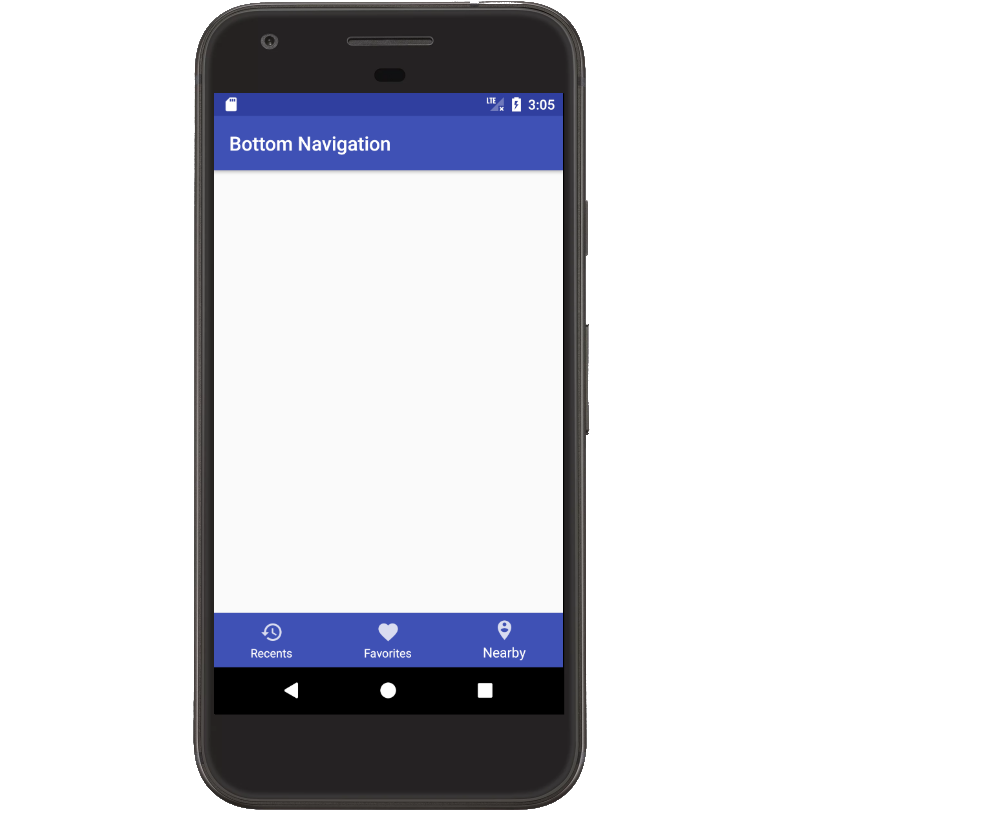
被接受的答案是好的,但我发现组织有点难以遵循,一些内容是不必要的。 以下完整示例显示如何使底部导航栏与问题中的图像相似。
添加devise支持库
将此行添加到应用程序的build.grade文件旁边的其他支持库的东西。
implementation 'com.android.support:design:26.1.0'
用任何当前版本replace版本号。 如果您仍在使用Android Studio 2.x,请使用compile而不是implementation 。
创build活动布局
我们添加到布局的唯一特别的事情就是BottomNavigationView 。 点击时改变图标和文本的颜色,可以使用selector而不是直接指定颜色。 这里为简单起见省略。
activity_main.xml中
<?xml version="1.0" encoding="utf-8"?> <RelativeLayout xmlns:android="http://schemas.android.com/apk/res/android" xmlns:app="http://schemas.android.com/apk/res-auto" android:layout_width="match_parent" android:layout_height="match_parent"> <android.support.design.widget.BottomNavigationView android:id="@+id/bottom_navigation" android:layout_width="match_parent" android:layout_height="wrap_content" android:layout_alignParentBottom="true" app:menu="@menu/bottom_nav_menu" app:itemBackground="@color/colorPrimary" app:itemIconTint="@android:color/white" app:itemTextColor="@android:color/white" /> </RelativeLayout>
请注意,我们使用了layout_alignParentBottom来将其放在最下面。
定义菜单项
底部导航视图的xml参考bottom_nav_menu 。 这是我们认为每个项目的定义。 我们现在就做好。 您只需添加一个菜单资源,就像操作栏或工具栏一样。
bottom_nav_menu.xml
<?xml version="1.0" encoding="utf-8"?> <menu xmlns:android="http://schemas.android.com/apk/res/android" xmlns:app="http://schemas.android.com/apk/res-auto"> <item android:id="@+id/action_recents" android:enabled="true" android:icon="@drawable/ic_action_recents" android:title="Recents" app:showAsAction="ifRoom" /> <item android:id="@+id/action_favorites" android:enabled="true" android:icon="@drawable/ic_action_favorites" android:title="Favorites" app:showAsAction="ifRoom" /> <item android:id="@+id/action_nearby" android:enabled="true" android:icon="@drawable/ic_action_nearby" android:title="Nearby" app:showAsAction="ifRoom" /> </menu>
您将需要添加适当的图标到您的项目。 如果转到“ 文件”>“新build”>“图像资源”,并select“操作栏”和“选项卡图标”作为“图标types”,这不是非常困难。
添加一个项目select侦听器
这里没有什么特别的事情发生。 我们只是在我们的Activity的onCreate方法中添加一个监听器到Bottom Navigation Bar。
public class MainActivity extends AppCompatActivity { @Override protected void onCreate(Bundle savedInstanceState) { super.onCreate(savedInstanceState); setContentView(R.layout.activity_main); BottomNavigationView bottomNavigationView = (BottomNavigationView) findViewById(R.id.bottom_navigation); bottomNavigationView.setOnNavigationItemSelectedListener(new BottomNavigationView.OnNavigationItemSelectedListener() { @Override public boolean onNavigationItemSelected(@NonNull MenuItem item) { switch (item.getItemId()) { case R.id.action_recents: Toast.makeText(MainActivity.this, "Recents", Toast.LENGTH_SHORT).show(); break; case R.id.action_favorites: Toast.makeText(MainActivity.this, "Favorites", Toast.LENGTH_SHORT).show(); break; case R.id.action_nearby: Toast.makeText(MainActivity.this, "Nearby", Toast.LENGTH_SHORT).show(); break; } return true; } }); } }
需要更多的帮助?
我学会了如何做到这一点看下面的YouTubevideo。 电脑的声音有点奇怪,但演示非常清晰。
- Android Studio教程 – 底部导航视图
我已经提到这个github的post ,我已经在底部的标签栏中设置了three fragment页面的three layouts 。
FourButtonsActivity.java:
bottomBar.setFragmentItems(getSupportFragmentManager(), R.id.fragmentContainer, new BottomBarFragment(LibraryFragment.newInstance(R.layout.library_fragment_layout), R.drawable.ic_update_white_24dp, "Recents"), new BottomBarFragment(PhotoEffectFragment.newInstance(R.layout.photo_effect_fragment), R.drawable.ic_local_dining_white_24dp, "Food"), new BottomBarFragment(VideoFragment.newInstance(R.layout.video_layout), R.drawable.ic_favorite_white_24dp, "Favorites") );
要设置徽章数量:
BottomBarBadge unreadMessages = bottomBar.makeBadgeForTabAt(1, "#E91E63", 4); unreadMessages.show(); unreadMessages.setCount(4); unreadMessages.setAnimationDuration(200); unreadMessages.setAutoShowAfterUnSelection(true);
LibraryFragment.java:
import android.os.Bundle; import android.support.annotation.Nullable; import android.support.v4.app.Fragment; import android.view.LayoutInflater; import android.view.View; import android.view.ViewGroup; public class LibraryFragment extends Fragment { private static final String STARTING_TEXT = "Four Buttons Bottom Navigation"; public LibraryFragment() { } public static LibraryFragment newInstance(int resource) { Bundle args = new Bundle(); args.putInt(STARTING_TEXT, resource); LibraryFragment sampleFragment = new LibraryFragment(); sampleFragment.setArguments(args); return sampleFragment; } @Nullable @Override public View onCreateView(LayoutInflater inflater, ViewGroup container, Bundle savedInstanceState) { View view = LayoutInflater.from(getActivity()).inflate( getArguments().getInt(STARTING_TEXT), null); return view; }
