如何随机锯齿得到撕纸效果?
我正在试图制作一个像下面的图片一样的撕纸效果:
与底部的撕裂的效果。 我看到了这一点 ,并能够做出如下所示的撕纸效果
.box { width: 300px; height: 150px; background: darkred; position: relative; display: inline-block; } .box:after { position: absolute; content: ""; width: 15px; height: 15px; transform: rotate(45deg); transform-origin: 0% 100%; background: darkred; left: 0; bottom: 0; box-shadow: 15px -15px 0 0 darkred, 30px -30px 0 0 darkred, 45px -45px 0 0 darkred, 60px -60px 0 0 darkred, 75px -75px 0 0 darkred, 90px -90px 0 0 darkred, 105px -105px 0 0 darkred, 120px -120px 0 0 darkred, 135px -135px 0 0 darkred, 150px -150px 0 0 darkred, 165px -165px 0 0 darkred, 180px -180px 0 0 darkred, 195px -195px 0 0 darkred; } <div class="box"></div>
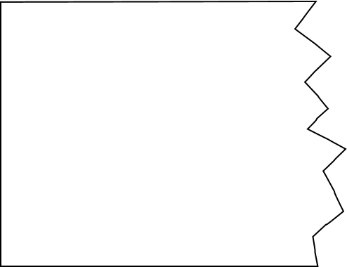
但问题是,撕裂的边缘看起来一样。 我希望他们有不同的大小和不同的形状。
这可以使用svg完成。 我使用Snap和jquery来创build它,因为它使一切都变得更容易。
以下片段创build随机撕碎的纸张效果。
注意:支持snap-IE9及以上版本,Safari,Chrome,Firefox和Opera 查看规格
支持svg caniuse
$(document).ready(function() { var s = Snap('svg'); var width = $('.content').outerWidth(); $('.effect').width(width); var lastX = 0; var pointsArray = [0, 0]; while (lastX <= width) { var randX = Math.floor(Math.random() * 25); var randY = Math.floor(Math.random() * 30); pointsArray.push(randX + lastX + ' ' + randY); lastX = lastX + randX; } var torn = s.polygon(pointsArray + " " + width + " 0").attr({ fill: 'orange' }) })
.content { width: 400px; height: 400px; background: orange; padding: 20px; } .effect { height: 50px; }
<script src="ajax/libs/snap.svg/0.3.0/snap.svg-min.js"></script> <script src="https://ajax.googleapis.com/ajax/libs/jquery/1.9.0/jquery.min.js"></script> <div class="torn"> <div class="content">Lorem ipsum dolor sit amet, consectetur adipiscing elit, sed do eiusmod tempor incididunt ut labore et dolore magna aliqua. Ut enim ad minim veniam, quis nostrud exercitation ullamco laboris nisi ut aliquip ex ea commodo consequat. Duis aute irure dolor in reprehenderit in voluptate velit esse cillum dolore eu fugiat nulla pariatur. Excepteur sint occaecat cupidatat non proident, sunt in culpa qui officia deserunt mollit anim id est laborum.</div> <div class="effect"> <svg width="100%" height="100%"></svg> </div> </div>
使用剪辑path:
也可以使用clip-path生成破纸效果只能使用HTML和CSS完成,但纯CSS版本不会产生随机剪辑效果,就像我们可以使用SNAP或其他SVG库实现的一样,但是会产生撕碎的纸张影响。
使用CSS clip-path的缺点是, 目前仅支持Webkit驱动的浏览器 。 Firefox仅支持url()语法,因此需要内联SVG,而IE却完全不支持。 [ 我可以使用 ]
.torn-paper{ height: 300px; width: 400px; background: tomato; -webkit-clip-path: polygon(0% 0%, 0% 97%, 2% 95%, 6% 99%, 12% 88%, 18% 92%, 27% 90%, 31% 97%, 39% 91%, 47% 95%, 60% 83%, 62% 81%, 69% 93%, 72% 96%, 79% 87%, 100% 99%, 100% 0%); clip-path: polygon(0% 0%, 0% 97%, 2% 95%, 6% 99%, 12% 88%, 18% 92%, 27% 90%, 31% 97%, 39% 91%, 47% 95%, 60% 83%, 62% 81%, 69% 93%, 72% 96%, 79% 87%, 100% 99%, 100% 0%); }
<div class='torn-paper'>Lorem ipsum dolor sit amet</div>
我相信这个post可能已经死了,但是我留下了这个评论,以防有人发现有帮助。 我用下面的CSS创build了一个锯齿效果:
clip-path: polygon(3% 0, 7% 1%, 11% 0%, 16% 2%, 20% 0, 23% 2%, 28% 2%, 32% 1%, 35% 1%, 39% 3%, 41% 1%, 45% 0%, 47% 2%, 50% 2%, 53% 0, 58% 2%, 60% 2%, 63% 1%, 65% 0%, 67% 2%, 69% 2%, 73% 1%, 76% 1%, 79% 0, 82% 1%, 85% 0, 87% 1%, 89% 0, 92% 1%, 96% 0, 98% 3%, 99% 3%, 99% 6%, 100% 11%, 98% 15%, 100% 21%, 99% 28%, 100% 32%, 99% 35%, 99% 40%, 100% 43%, 99% 48%, 100% 53%, 100% 57%, 99% 60%, 100% 64%, 100% 68%, 99% 72%, 100% 75%, 100% 79%, 99% 83%, 100% 86%, 100% 90%, 99% 94%, 99% 98%, 95% 99%, 92% 99%, 89% 100%, 86% 99%, 83% 100%, 77% 99%, 72% 100%, 66% 98%, 62% 100%, 59% 99%, 54% 99%, 49% 100%, 46% 98%, 43% 100%, 40% 98%, 38% 100%, 35% 99%, 31% 100%, 28% 99%, 25% 99%, 22% 100%, 19% 99%, 16% 100%, 13% 99%, 10% 99%, 7% 100%, 4% 99%, 2% 97%, 1% 97%, 0% 94%, 1% 89%, 0% 84%, 1% 81%, 0 76%, 0 71%, 1% 66%, 0% 64%, 0% 61%, 0% 59%, 1% 54%, 0% 49%, 1% 45%, 0% 40%, 1% 37%, 0% 34%, 1% 29%, 0% 23%, 2% 20%, 1% 17%, 1% 13%, 0 10%, 1% 6%, 1% 3%);
现在,我相信这可以进一步提炼,以提供一个更有说服力的外观,但我认为这是一个很好的方式给一个形象领域粗糙的形状。
